Brand Identity · Illustration System · Art Direction · Web Design · WordPress Development · Social Media Communication System
Stirling Education
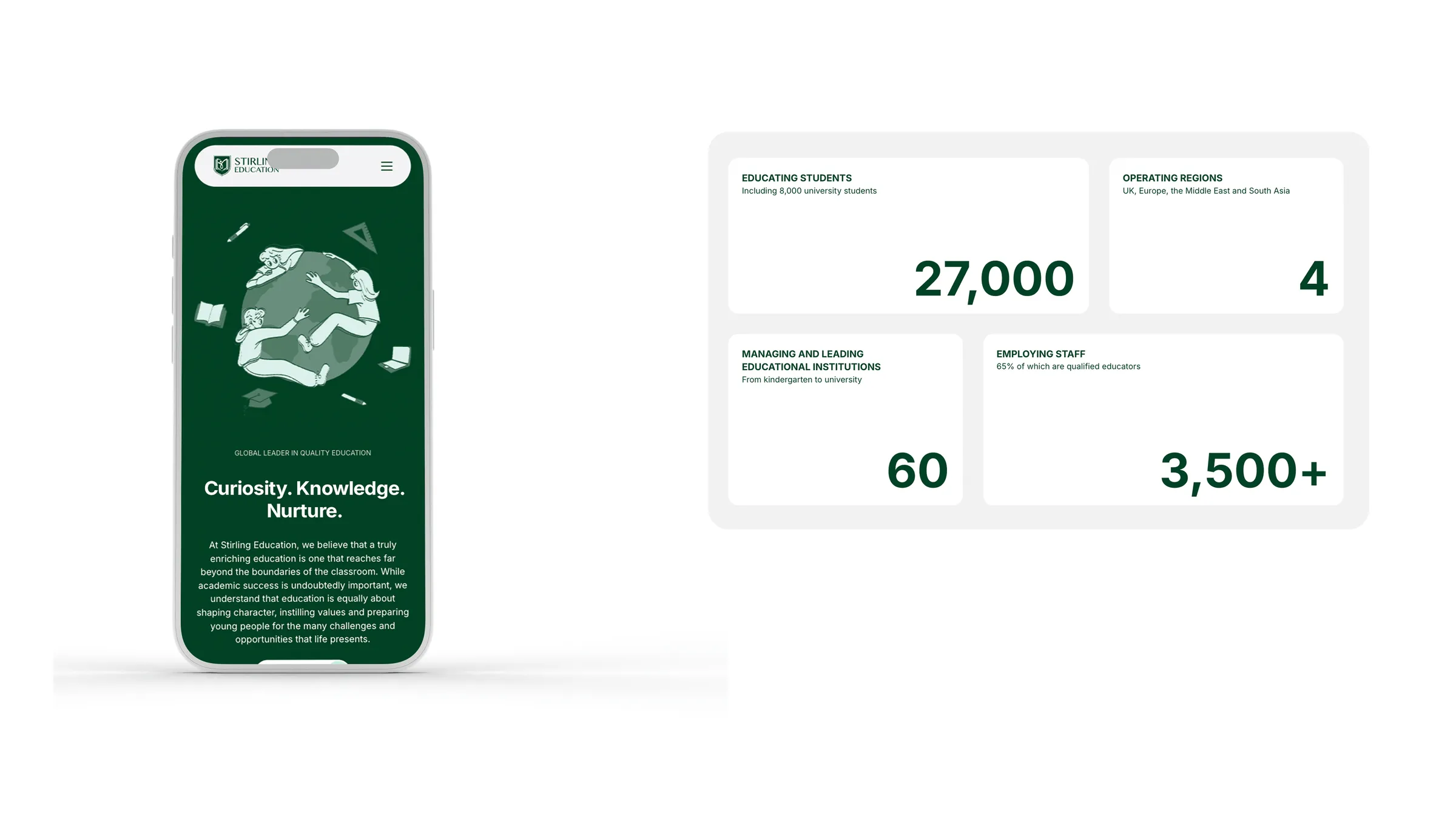
Stirling Education is an international education network with no visual system, no consistency, and no way to present a network of thousands of students across multiple countries as one entity. We built a complete communication apparatus from a single source, capable of operating at a global level.
The work
Challenge
Stirling Education is an international education network operating across multiple regions, including the UK, Europe, the Middle East, and South Asia. When they came to us, they had a logo and a set of base colours. Everything else was missing. No system, no consistency, no way for a network of this size, thousands of students and hundreds of staff spread across multiple countries, to present itself as one coherent entity. The brief was not just design. It was building a complete communication system from scratch, and everything had to come from a single source.
Process
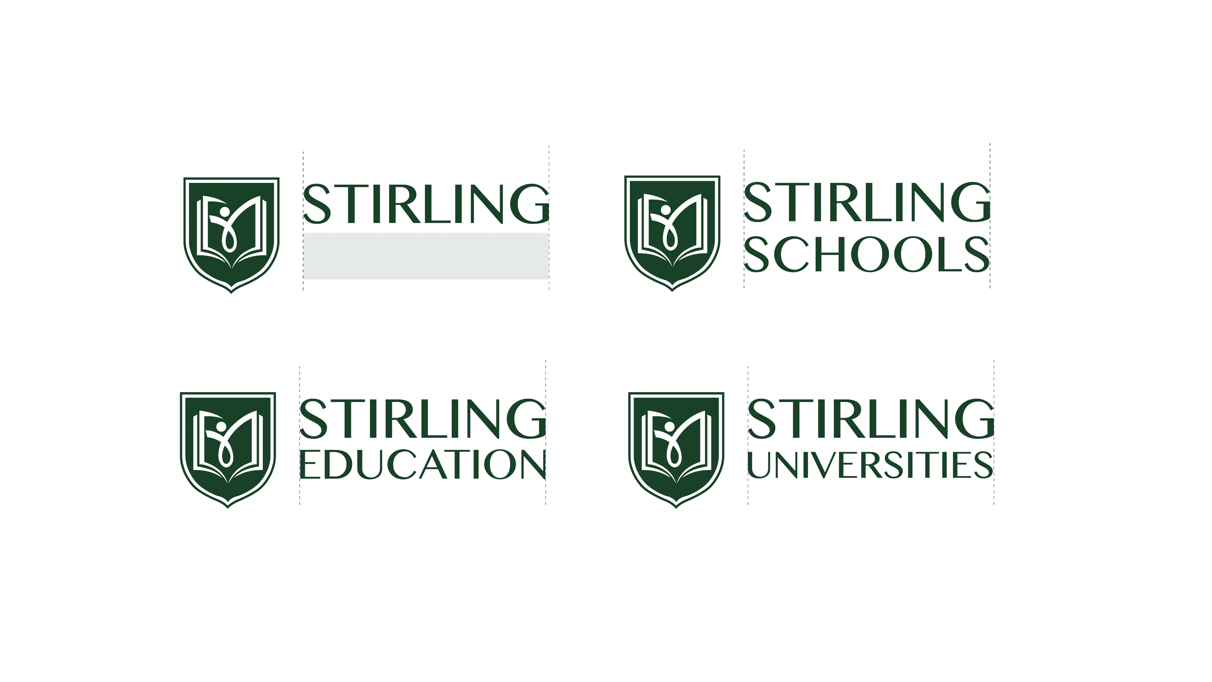
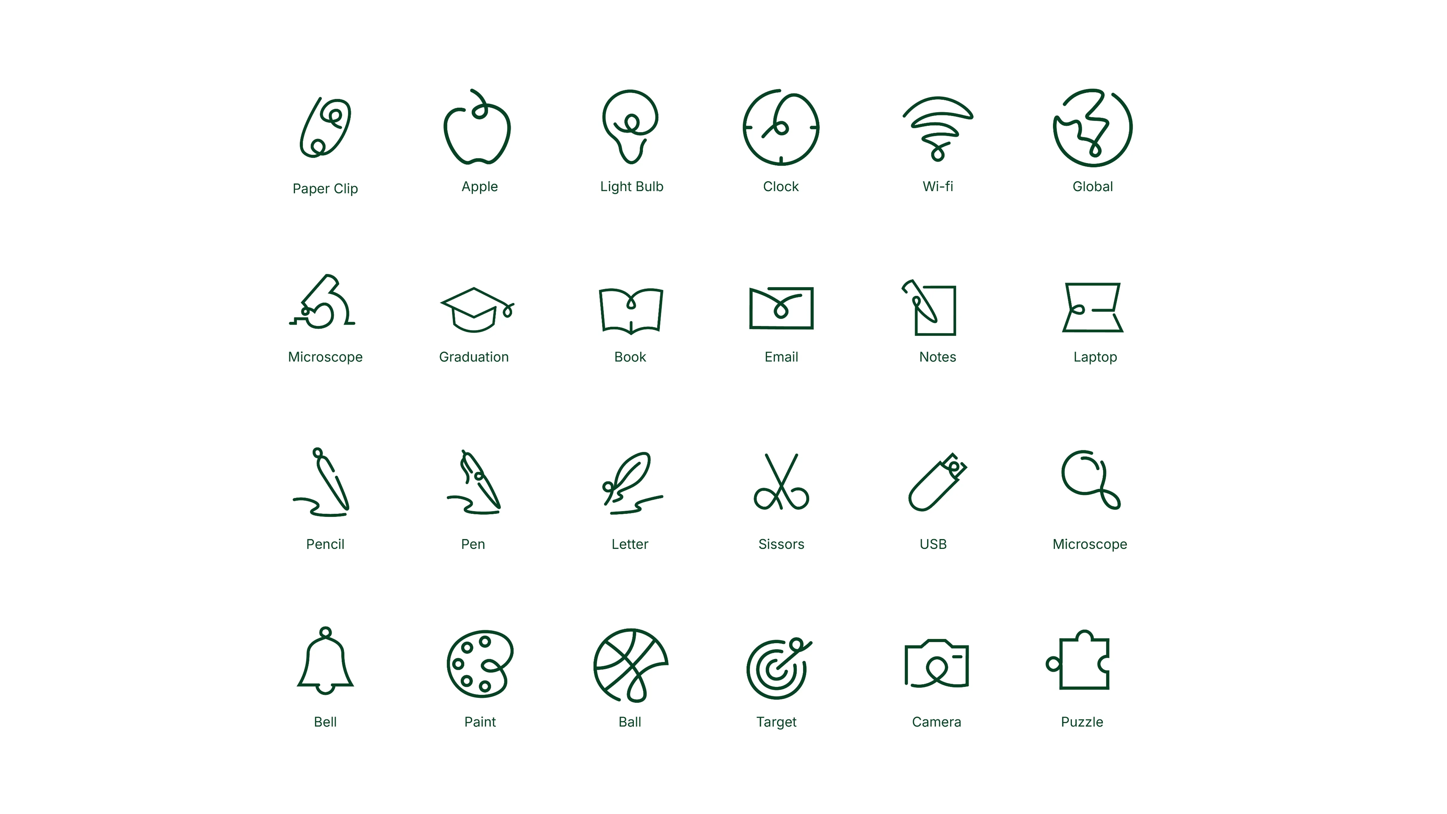
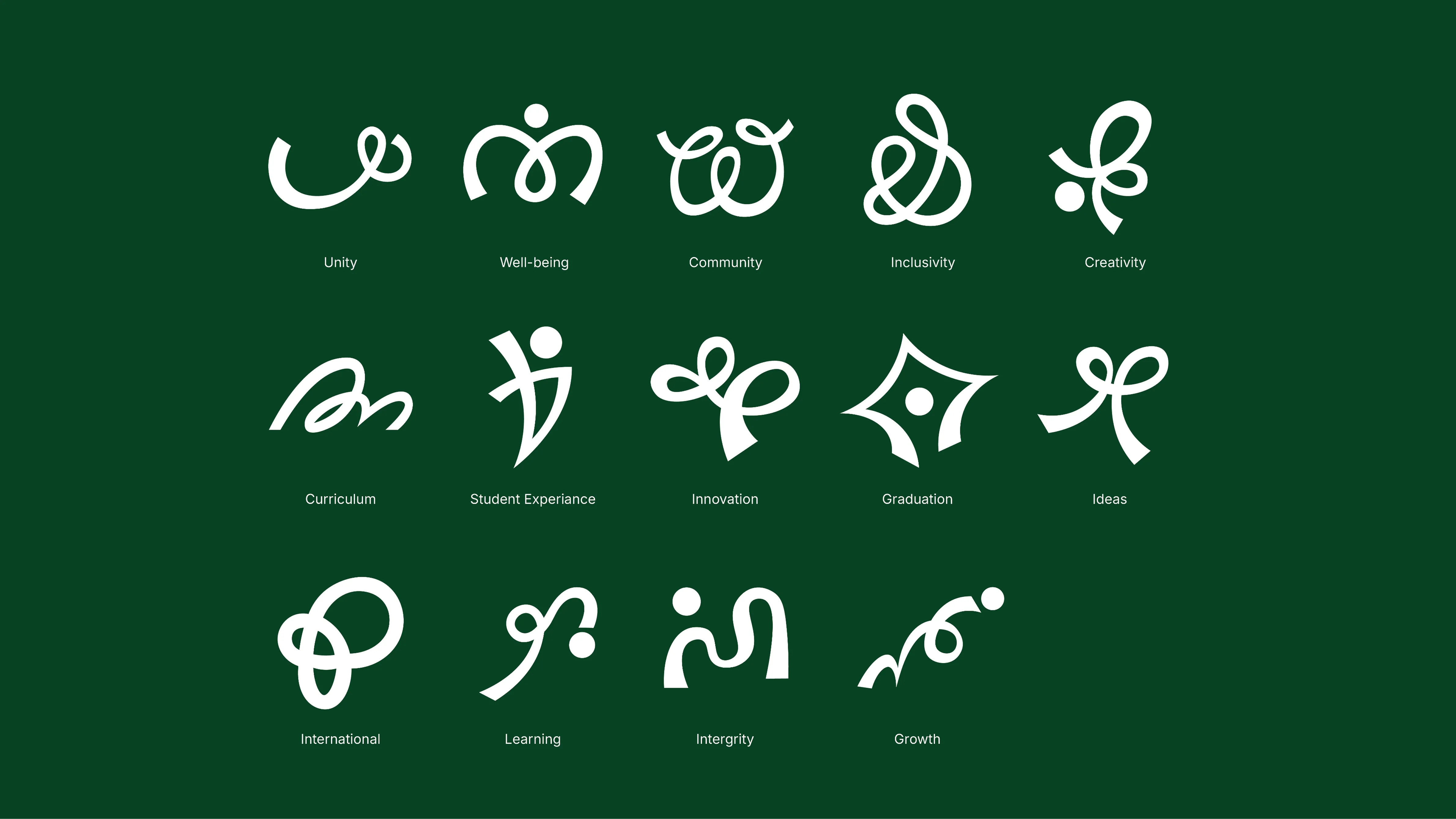
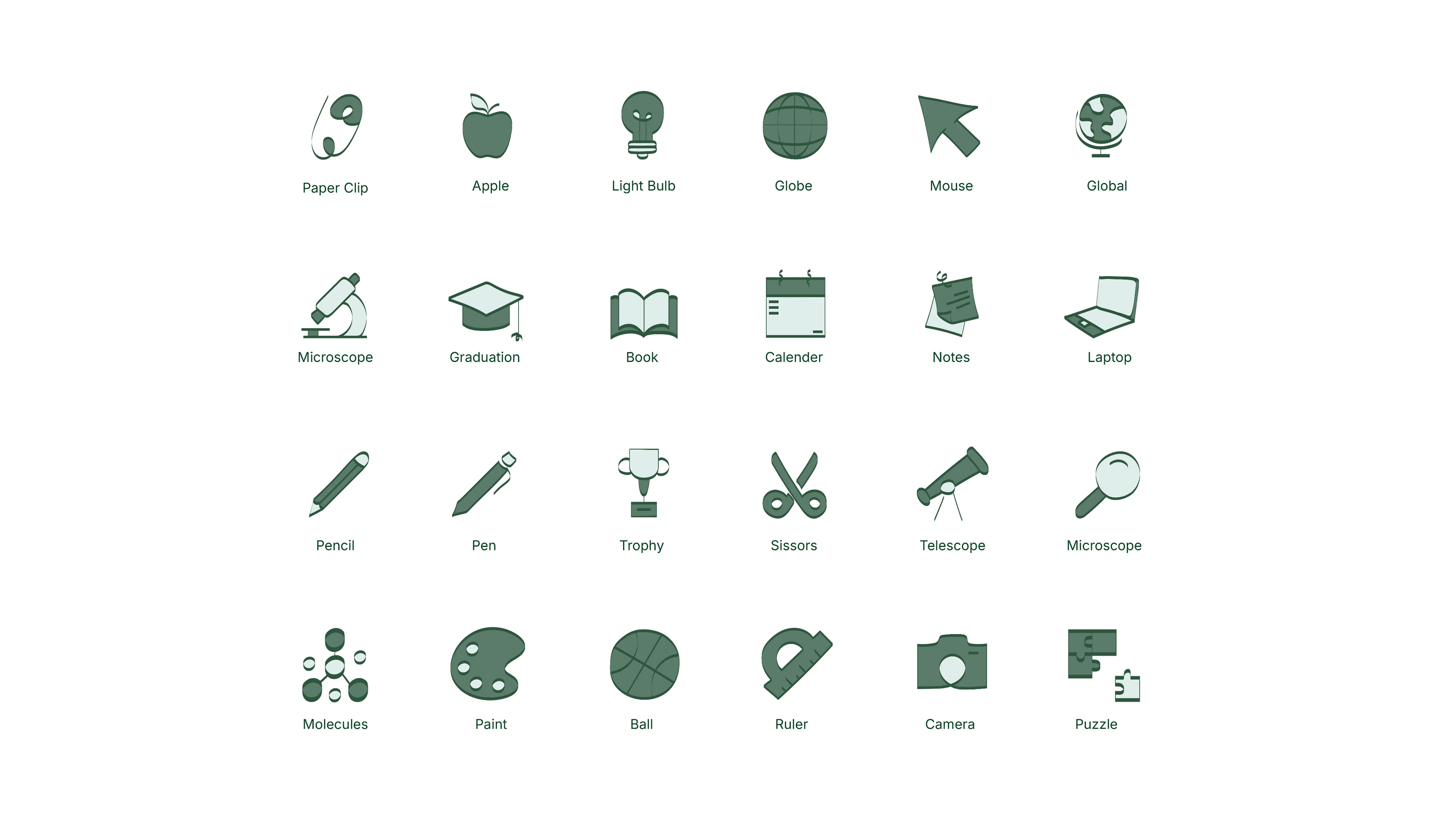
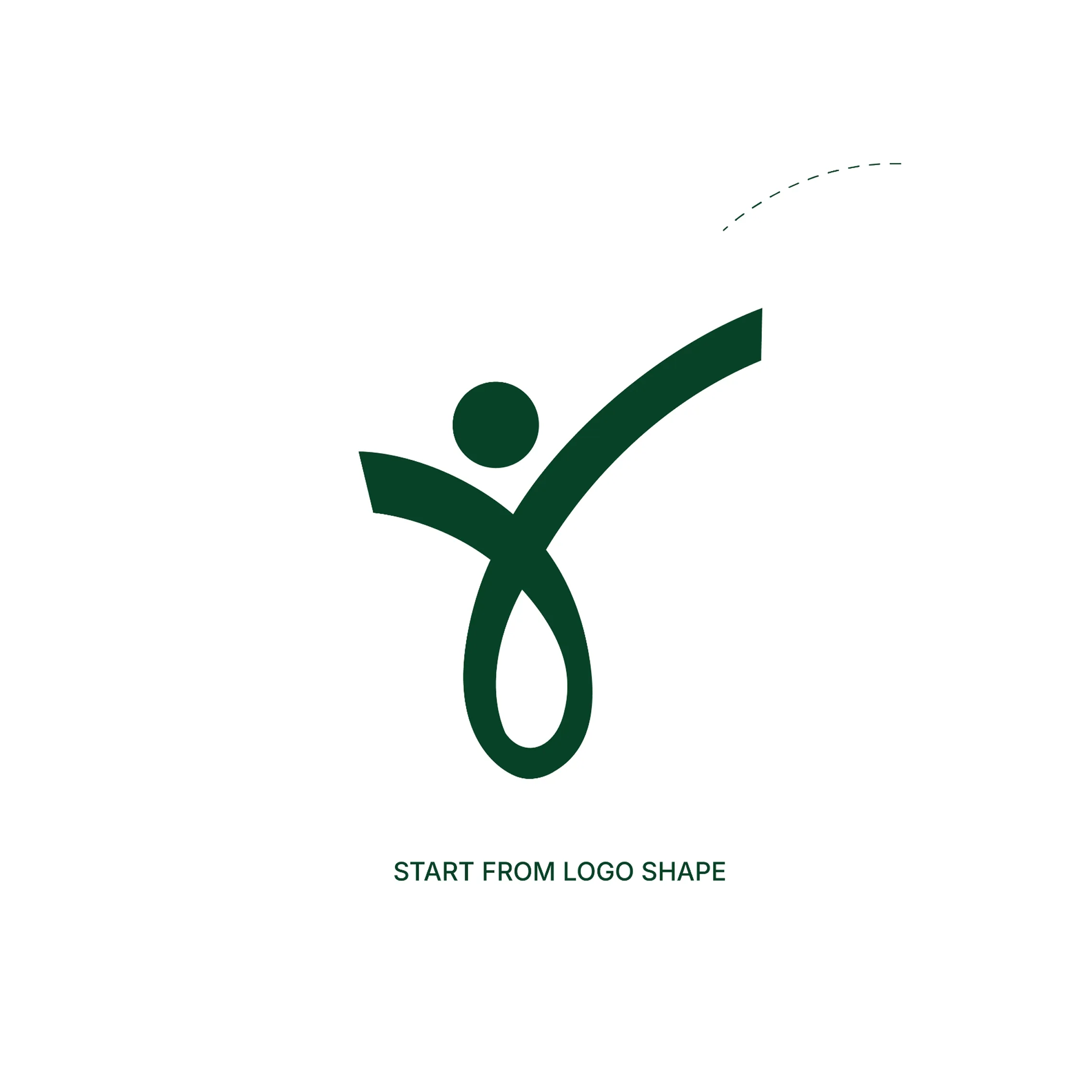
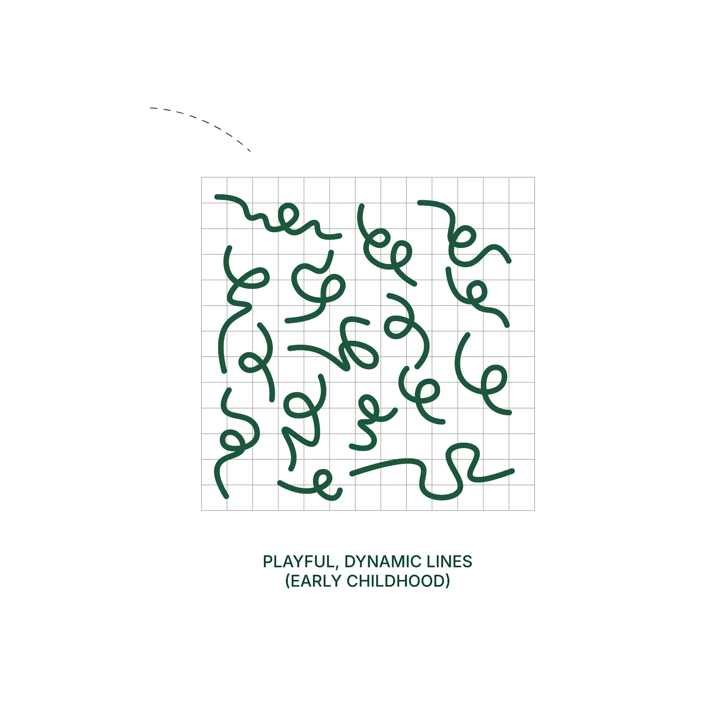
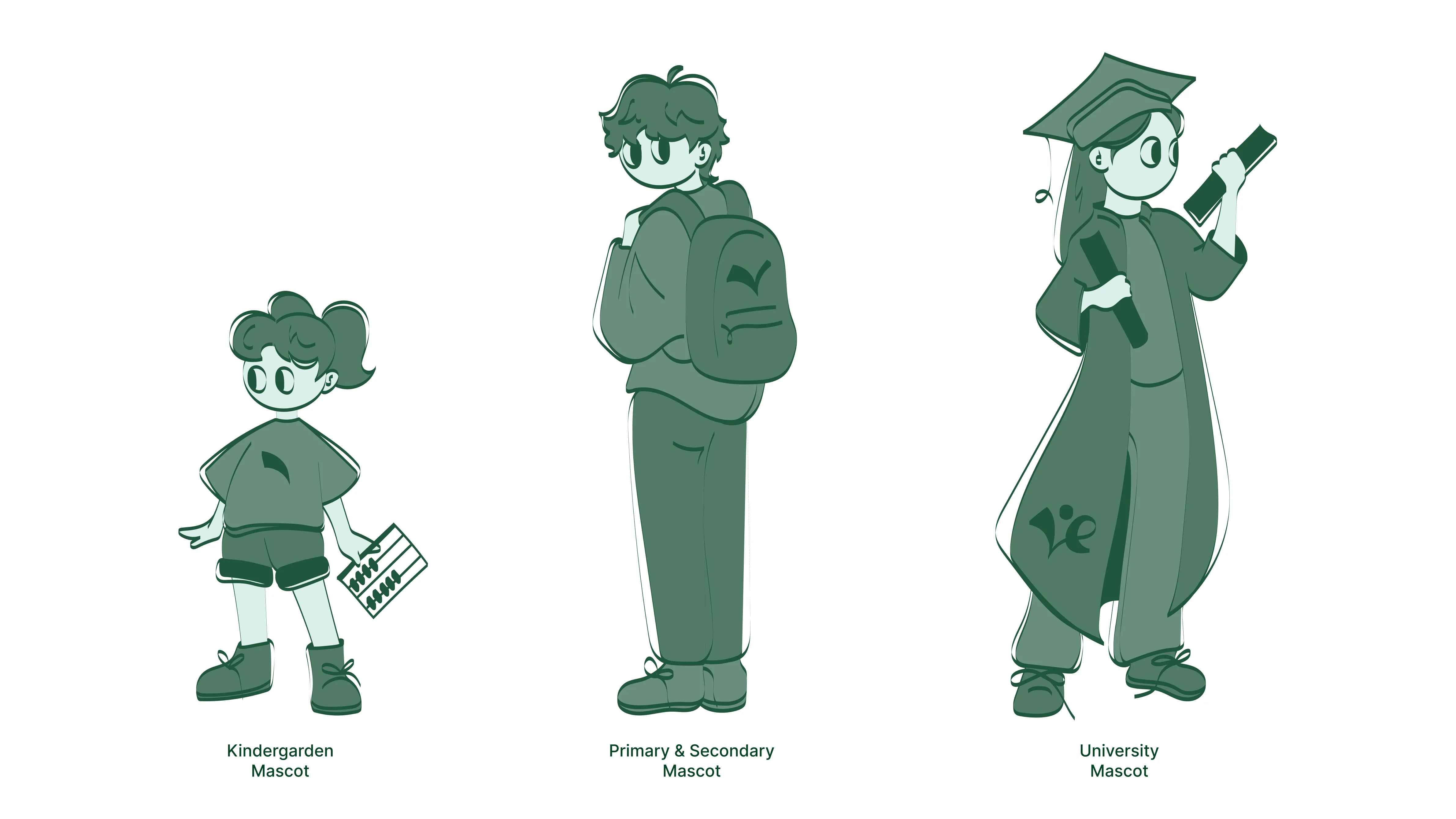
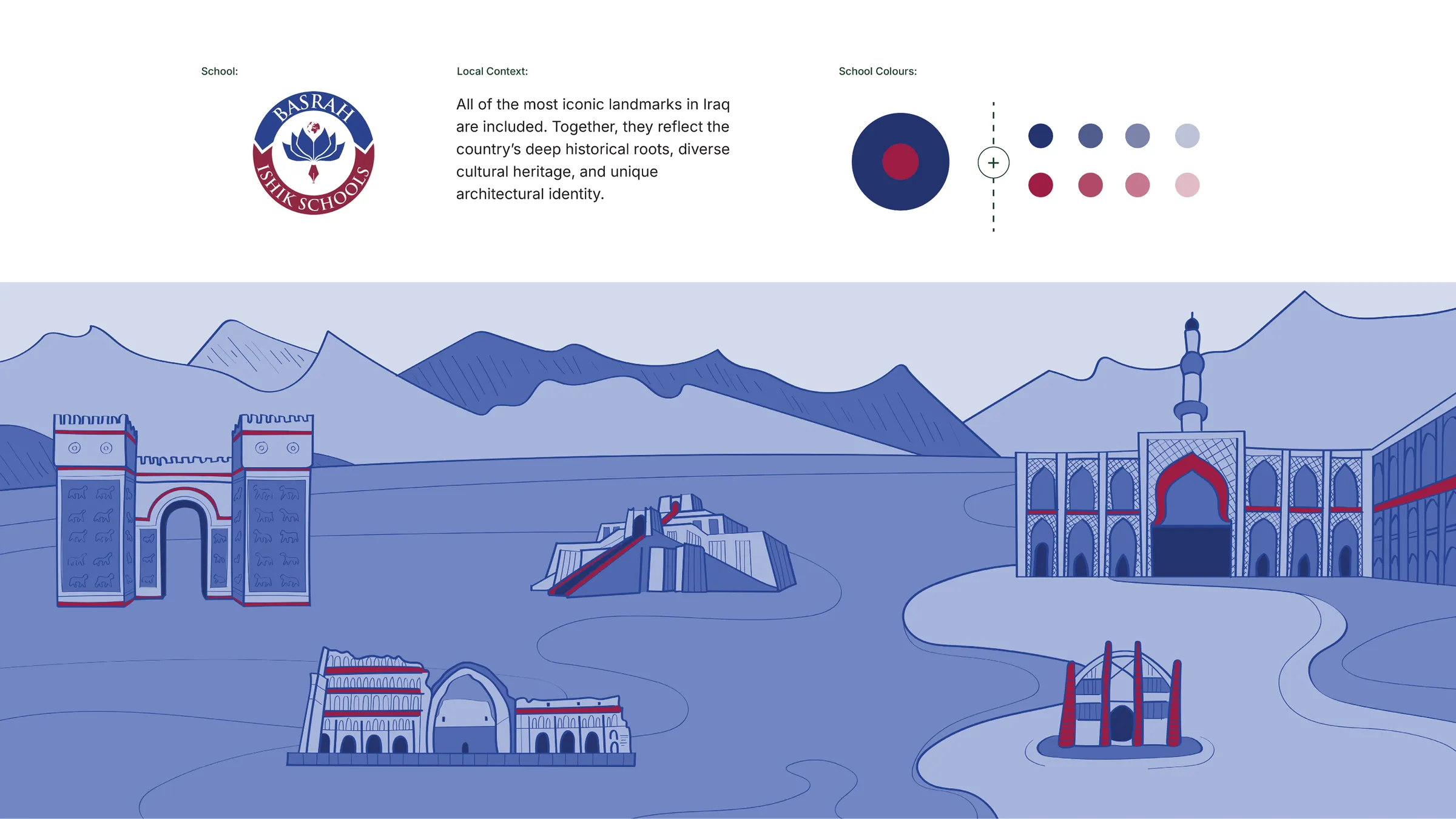
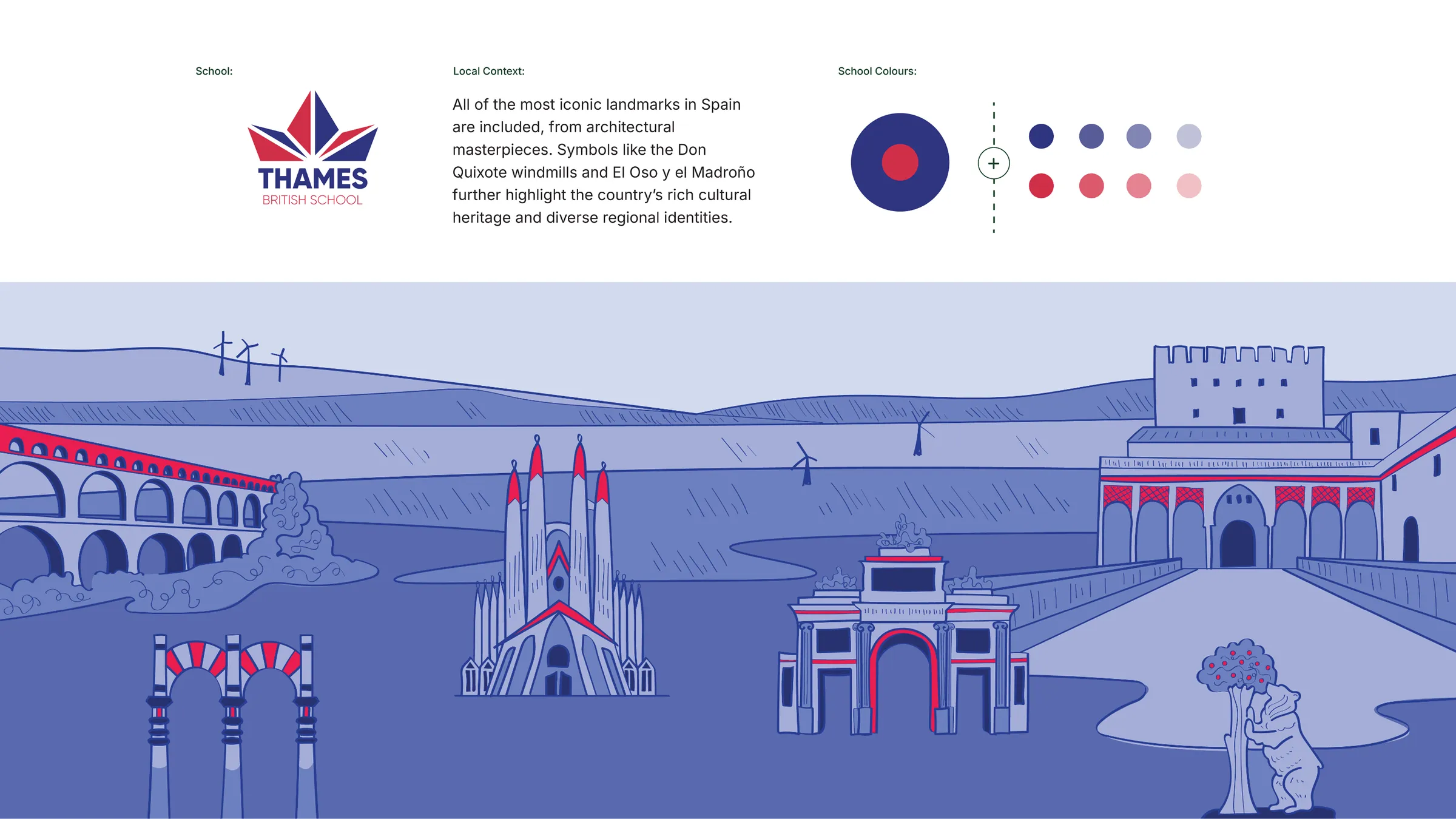
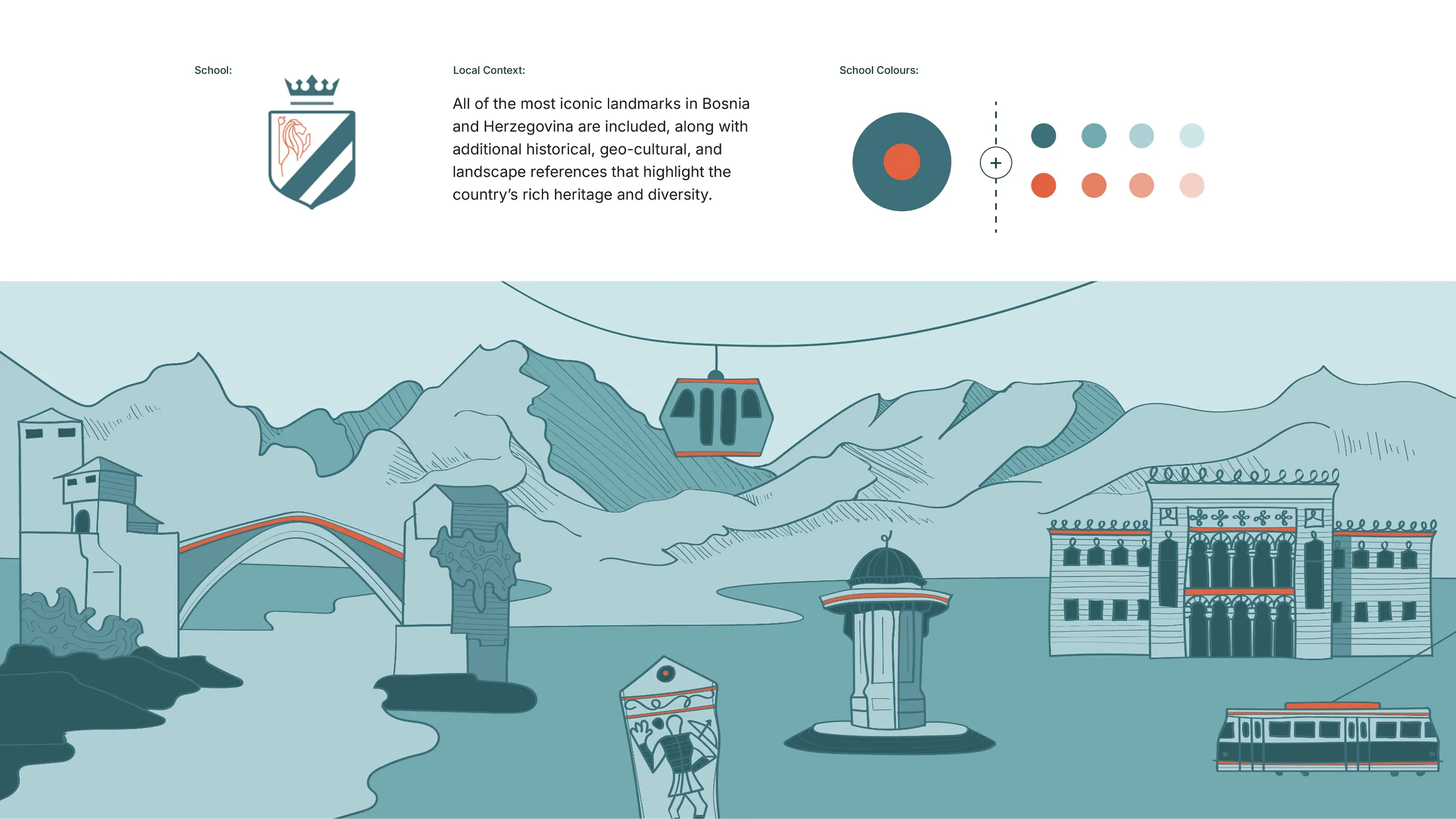
That source was the pictogram in the logo. Rather than building a parallel visual language that might conflict with what already existed, we extracted everything from the lines and style already present: stroke weight, the way shapes close, the geometric logic of the form. From that single element we developed a complete visual system. That meant precise colour specifications across all formats, a typographic system that works from large display formats down to body text, rules for logo application across every context, and a custom illustration system that we defined and built in full. From the visual style to individual illustrations and the supporting graphic elements used across all communication. The illustrations are not decoration. They are an extension of the logo in motion. When someone sees an illustration on the website or in a social media post, without knowing it, they are reading the same visual DNA that lives in the brand from the start. Photography coming in from different schools was not unified, and for a network that needs to read as a single entity, that is a direct problem. We developed a photography art direction guide that defined focus, moment, and atmosphere for every school to work from: which moments to capture, where the focus should sit, how to balance energy with authenticity. This is art direction, not just guidelines. The result was photography from schools in different countries beginning to read as part of the same story, without anyone needing to oversee every shoot.
Solution
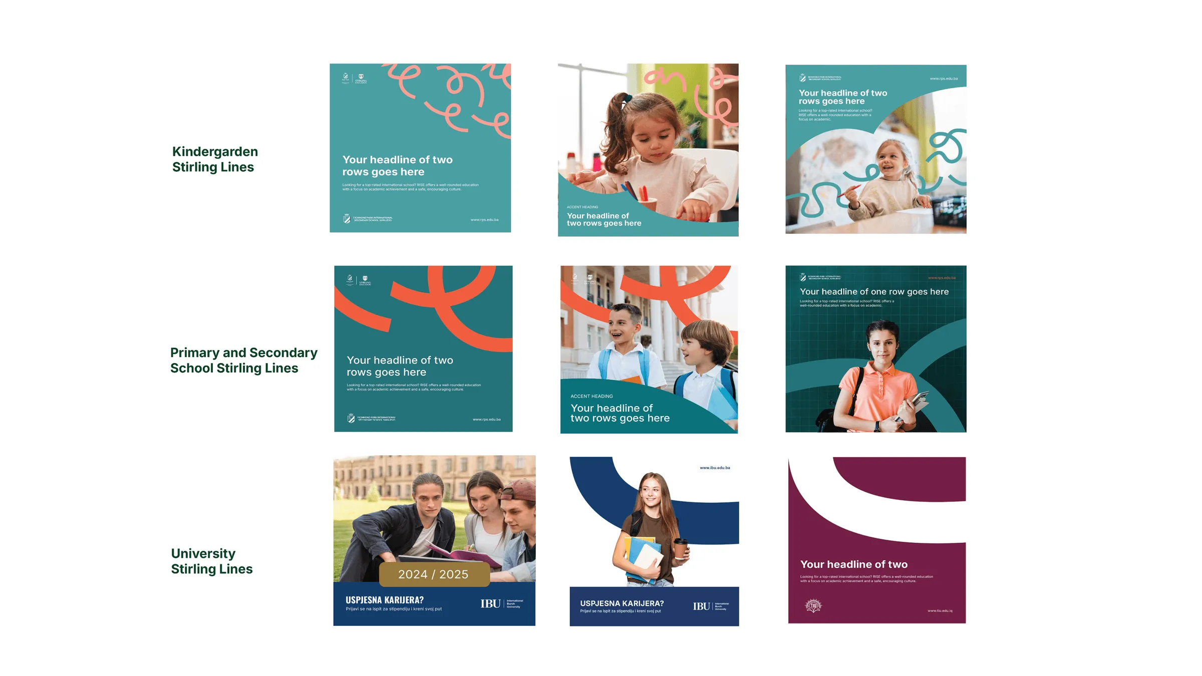
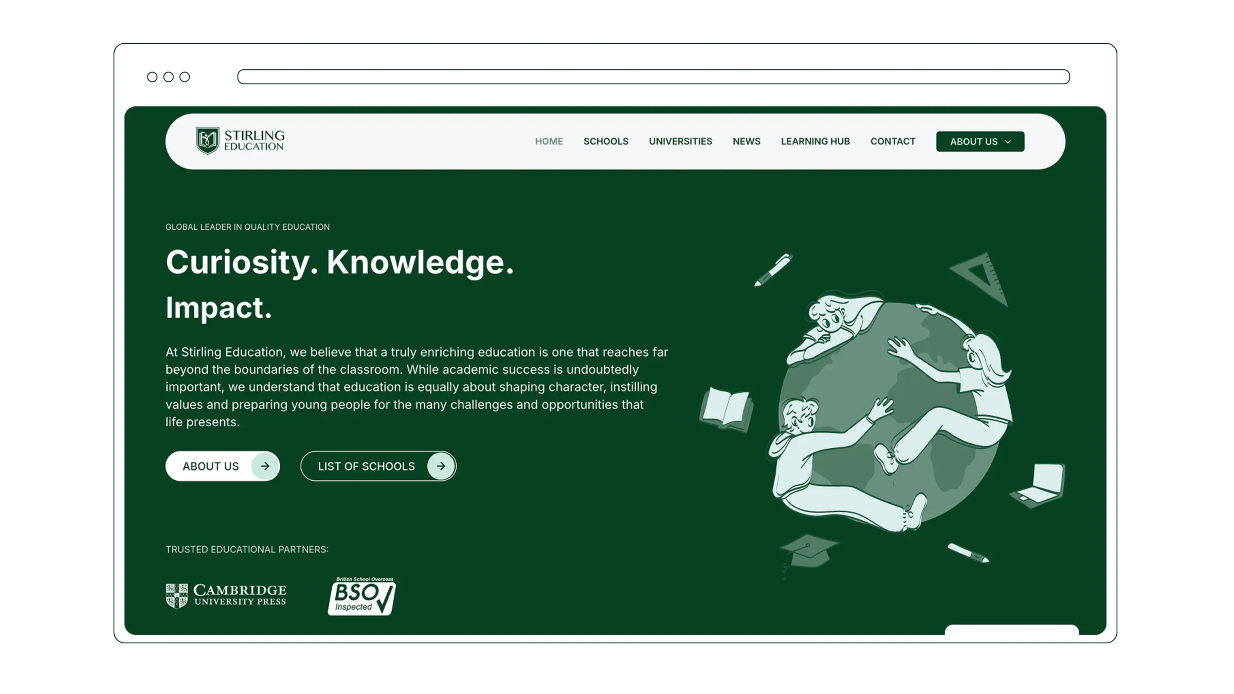
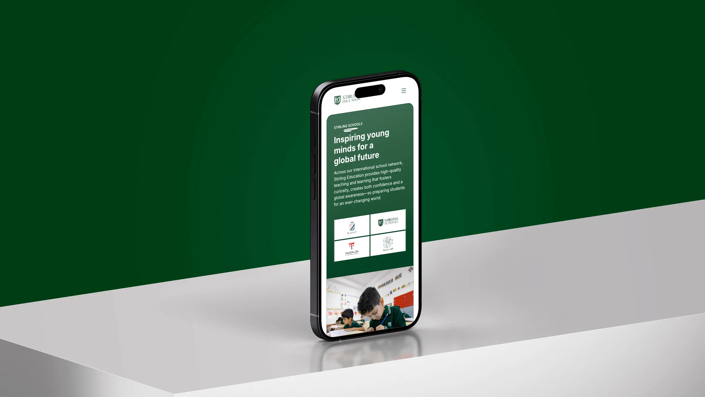
The website presented an architectural challenge specific to this type of client. Stirling does not operate as one school but as a network covering multiple levels of education, from kindergarten through to doctoral studies, across multiple regions and institutions. Each level needed a clear structure and its own story within one system. Rather than overcomplicating the architecture, we leaned on the visual system we had already built: illustrations, pictograms, and photography together, all from the same visual family. When the elements are cohesive, the site does not need to be complex to feel serious. We developed a structure with dedicated sections for Schools and Universities, a system for communicating global presence, and a visual language that holds authority and accessibility together. The final dimension of the project was building a social media communication system for the entire network and its schools. Here we added one concrete layer that makes the system functional across multiple markets and age groups simultaneously: line weight as a tool for tone. For primary schools we used thin, playful lines, light and free. As the communication moves toward higher education levels, the lines grow heavier, the layout calmer, the rhythm more considered. The same graphic element, the same logic, but line weight signals to the audience which level of communication they are looking at, without anything needing to be written explicitly. The template system we developed defines element positioning and visual hierarchy for every format, and is flexible enough for different schools in different countries to use consistently, without central oversight of every post.
Results
Stirling Education left the project with more than a brand and a website. They had a complete communication apparatus capable of operating at a global level: a visual system drawn from a single source, a photographic language that unifies material from multiple countries, illustrations that carry part of the message that text cannot, and a social media system that adapts to audience and tone while staying recognisable in every format. A system strong enough to hold the network together, and flexible enough to grow with it.