Brand Identity · Brand Architecture · Web Design · WordPress Development
Redshift Education
Redshift Education came to us with a name, a vision, and a story worth telling. We built a brand identity rooted in that story and a website structured to present a growing school network without making any single school feel secondary.
The work
Challenge
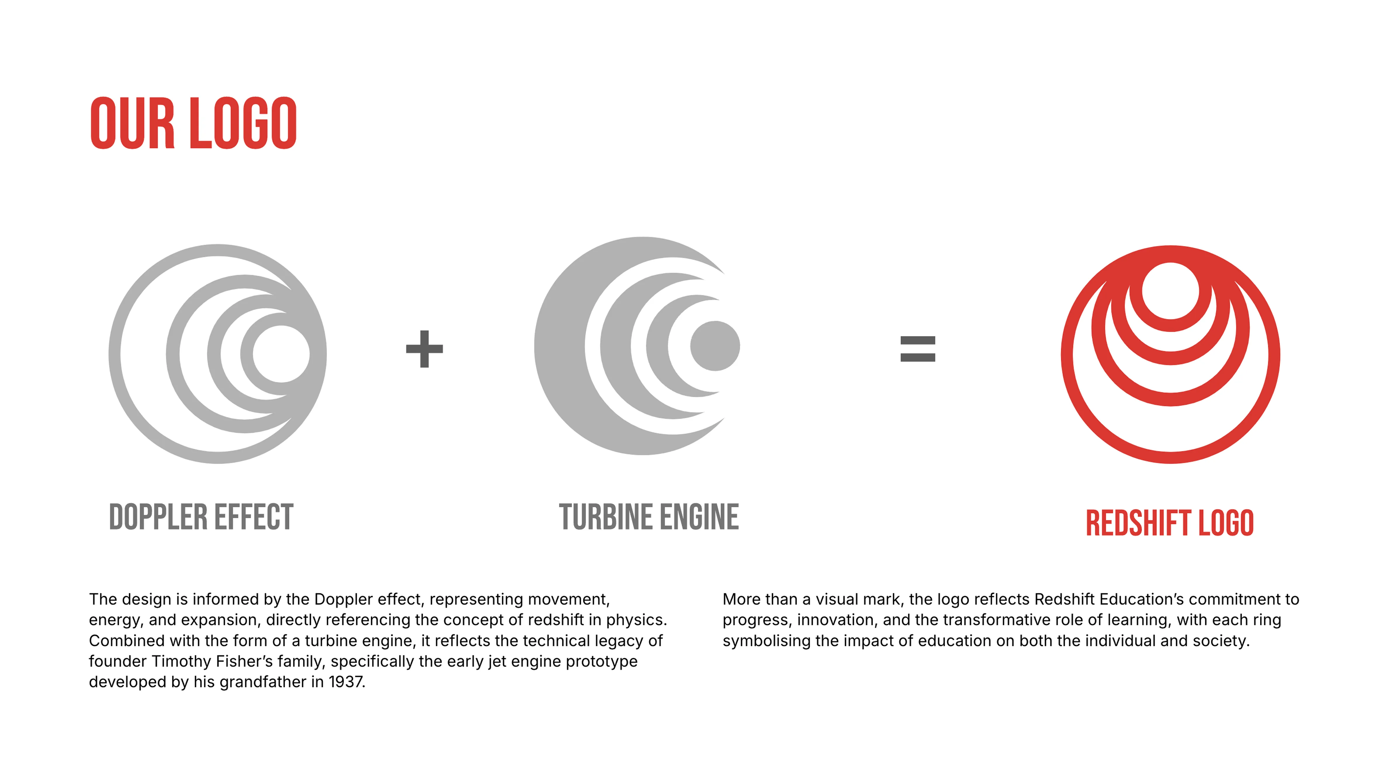
Redshift Education came to us with a name, a vision, and a story worth telling. The name itself carries two layers of meaning: an astronomical phenomenon describing the expansion of star systems bound by gravity, and a personal tribute to the Fisher family's engineering legacy, going back to a turbine engine prototype built in 1937. That story had to live somewhere in the brand. It couldn't be generic.
Process
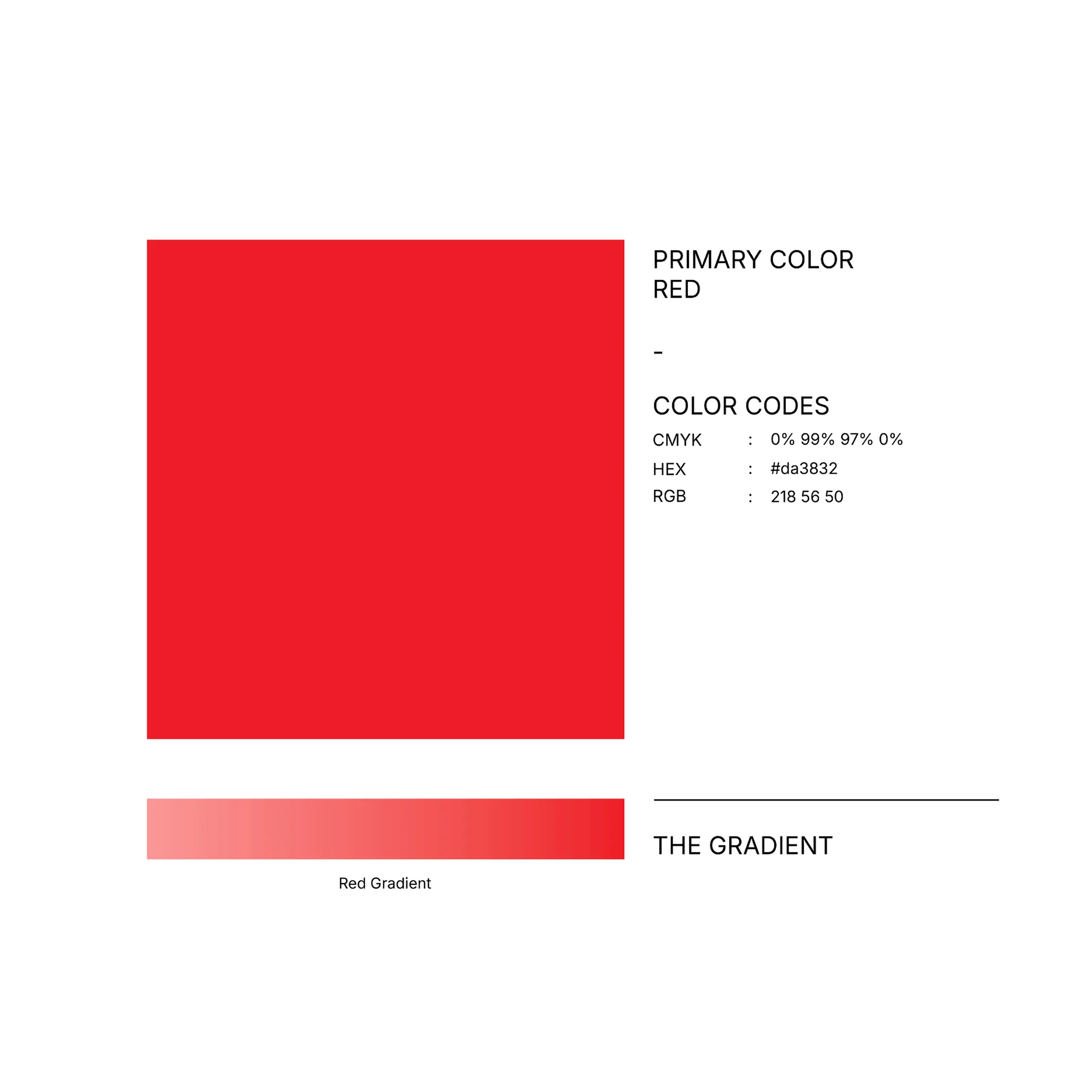
The logo became the focal point of the project. The owner wanted something personal embedded in the mark, a reference to the Fisher Redshift engine that gave the group its name. We built the symbol around that: concentric, orbital rings suggesting both the astronomical redshift and the circular motion of an engine. The colour followed from the engine too. A bold, confident red, not the institutional navy or muted tones that dominate British education branding. The result is a mark with a backstory you can see in the shape and feel in the weight.
Solution
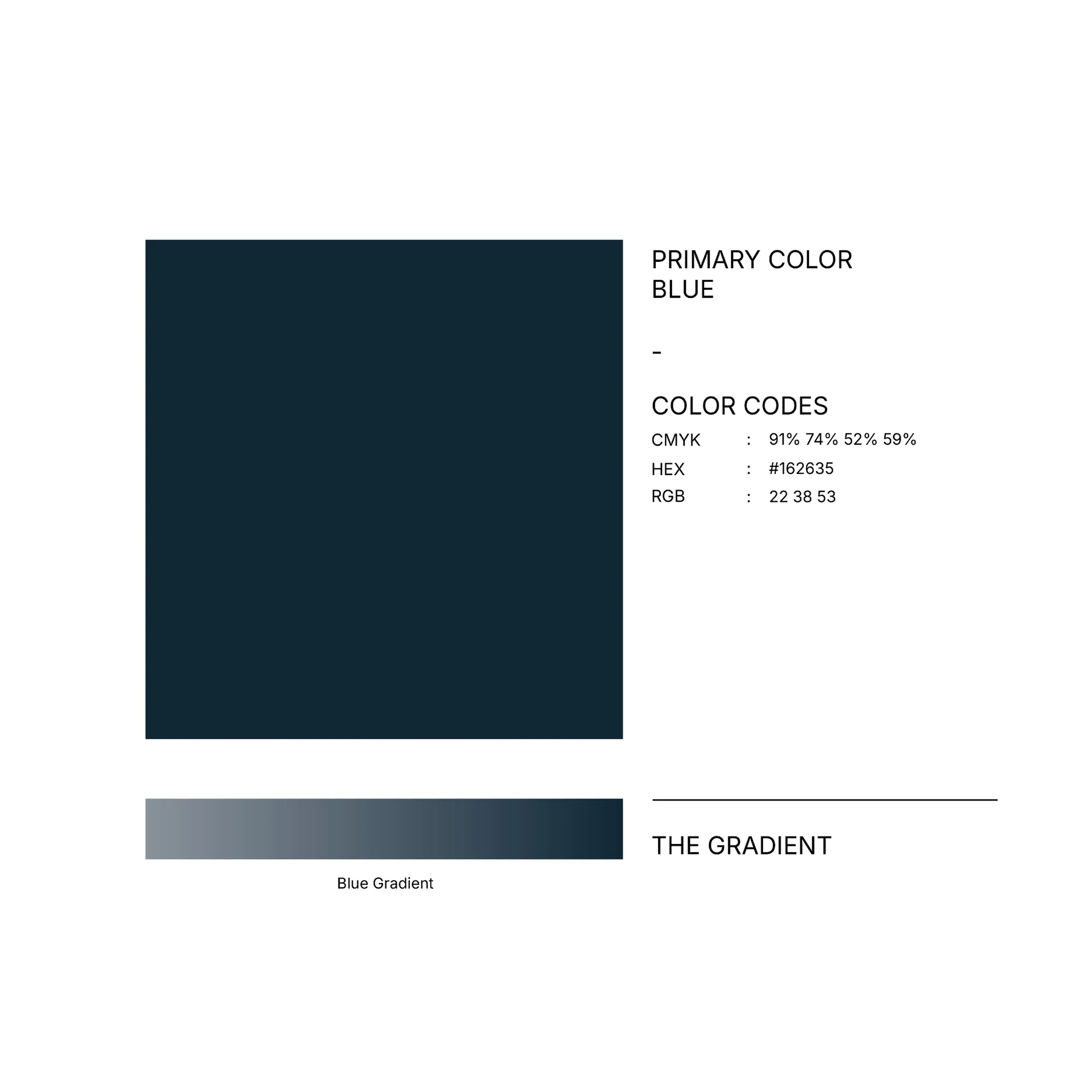
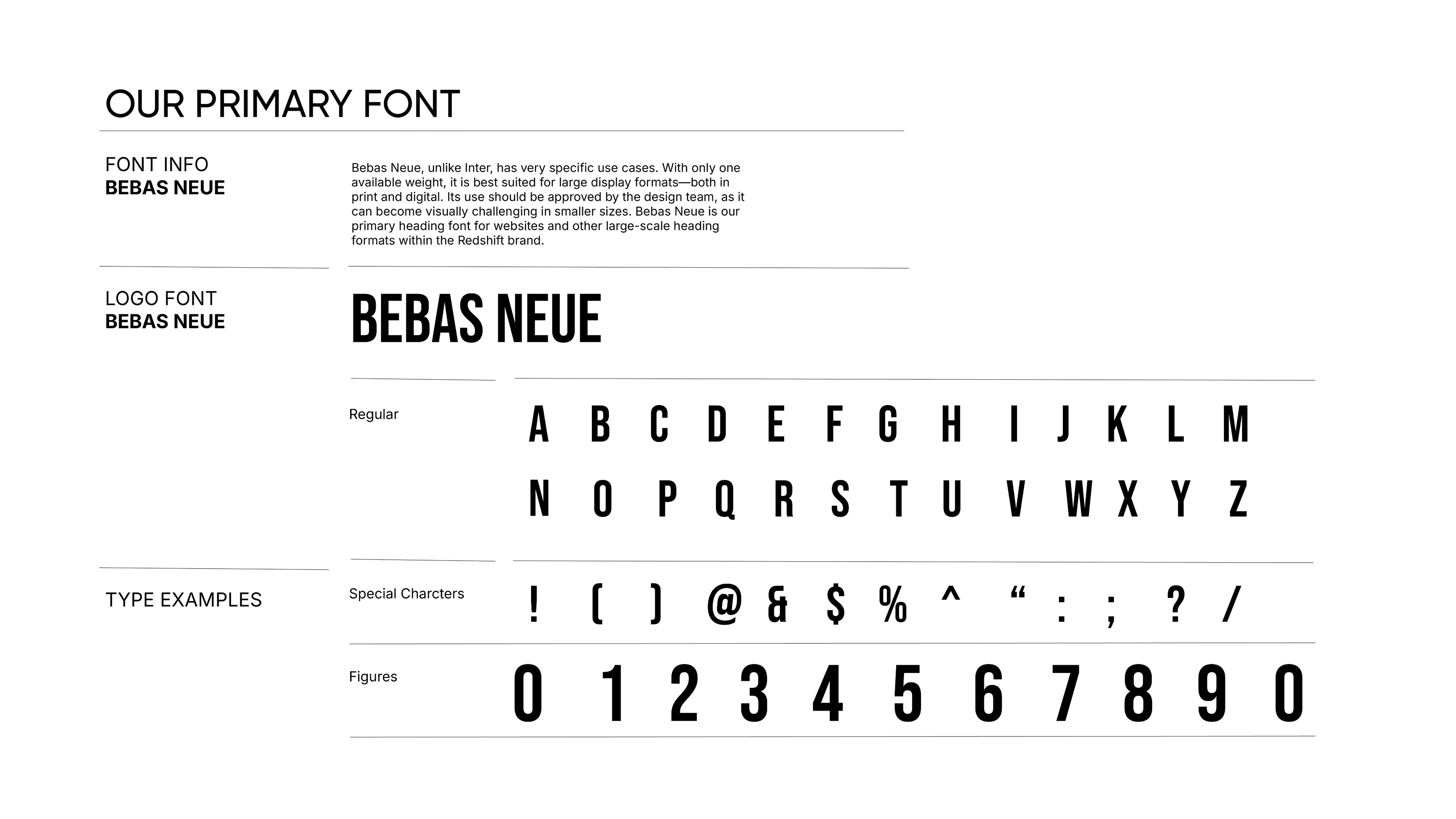
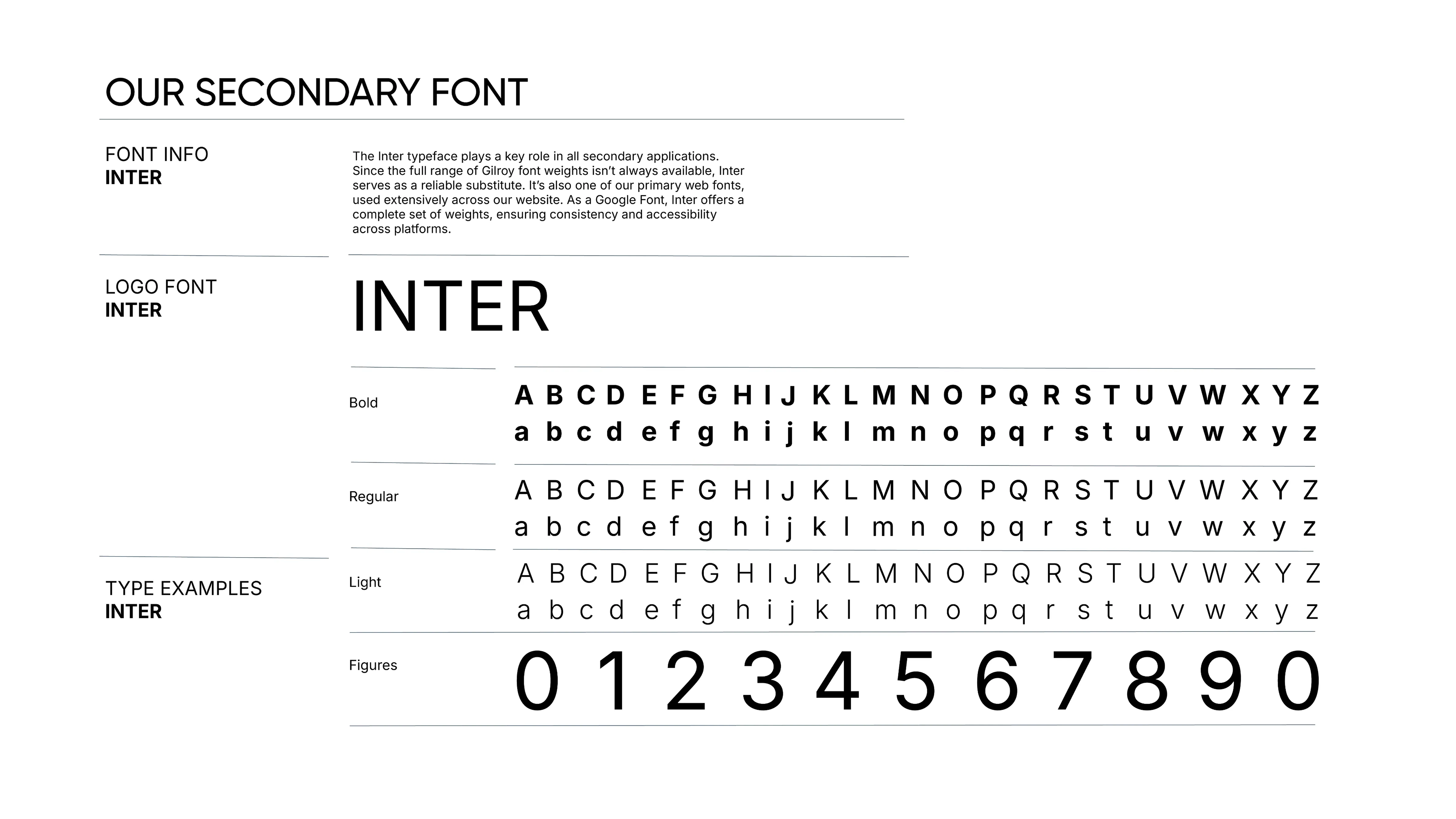
Once the identity was settled, everything else built from it. The website's job was clear: present a growing network of schools without making any single school feel secondary. The structure places Redshift as the parent organisation, then gives each school its own space and voice. Architecture first, aesthetics second. The Bebas Neue headings, the red and deep navy palette, the orbital symbol used as a graphic device across the system, all of it came directly from the brand logic we had already established.
Results
Redshift Education now operates as a coherent group with a brand system that scales with it. Each new school can be brought under the umbrella without losing the clarity of the whole. The website presents the group's vision, its schools, and its values without noise. It reads as what it is: a serious, growing education network with a distinctive identity and a reason for every decision in it.