Packaging Design · Label System · Brand Colour Architecture
Advelop Pet
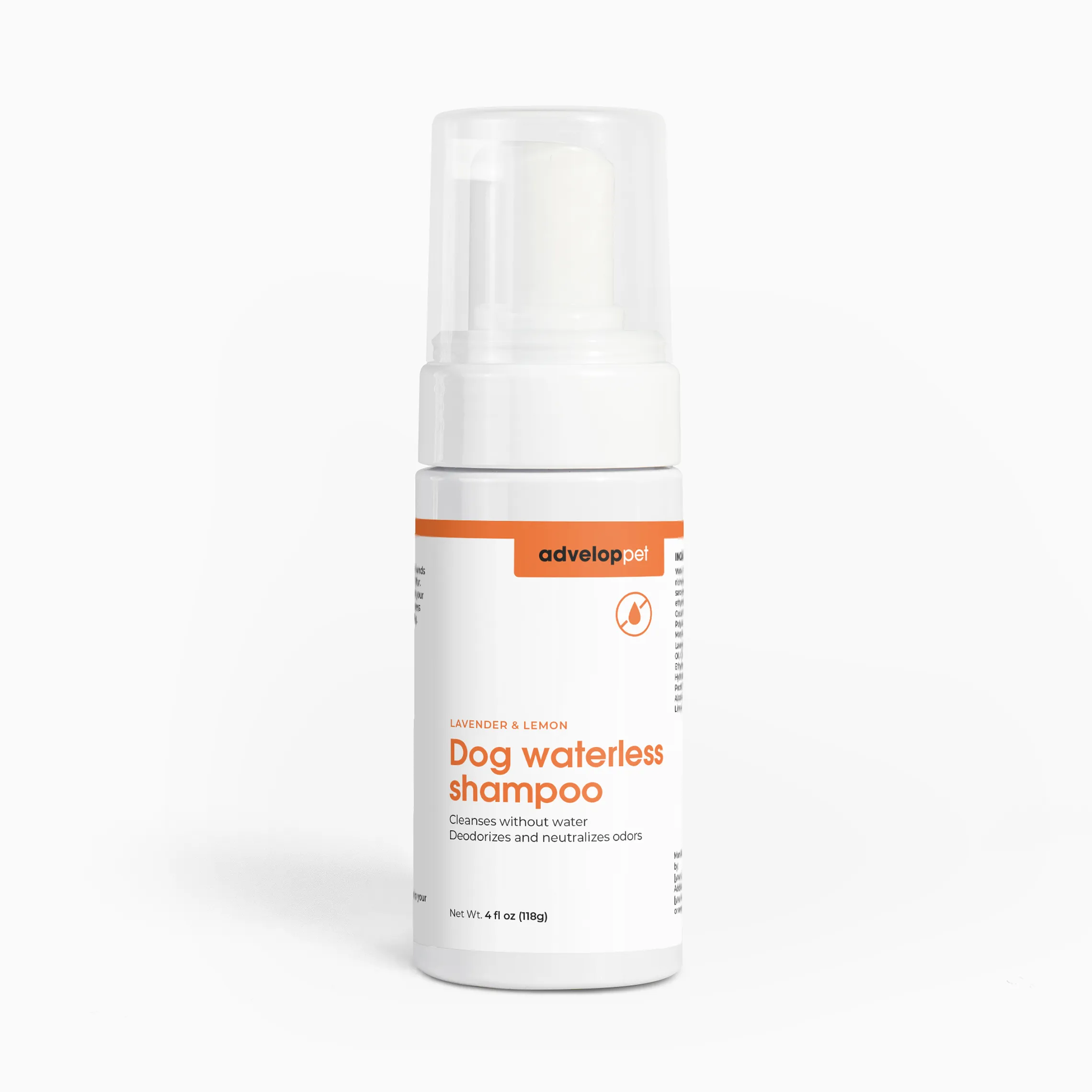
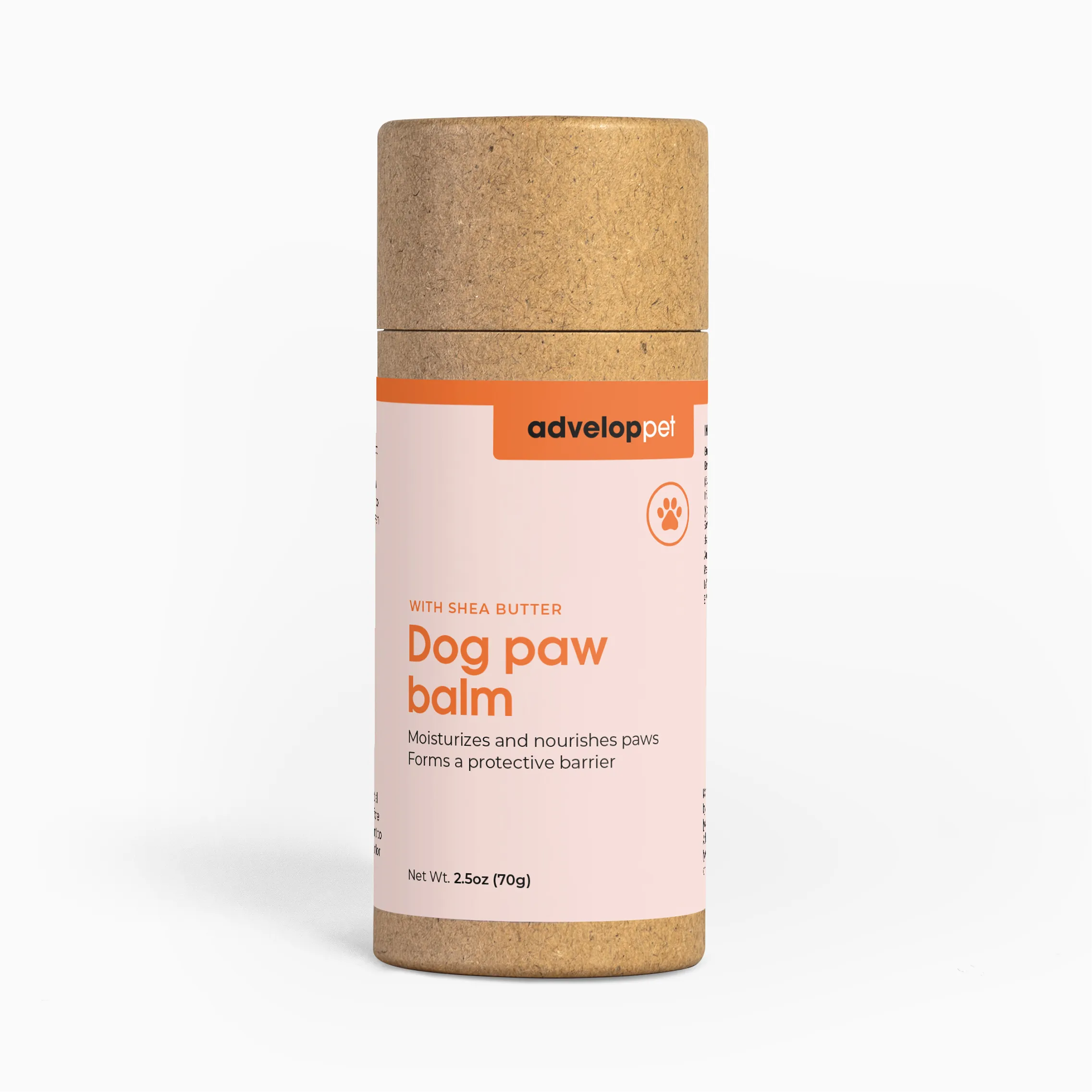
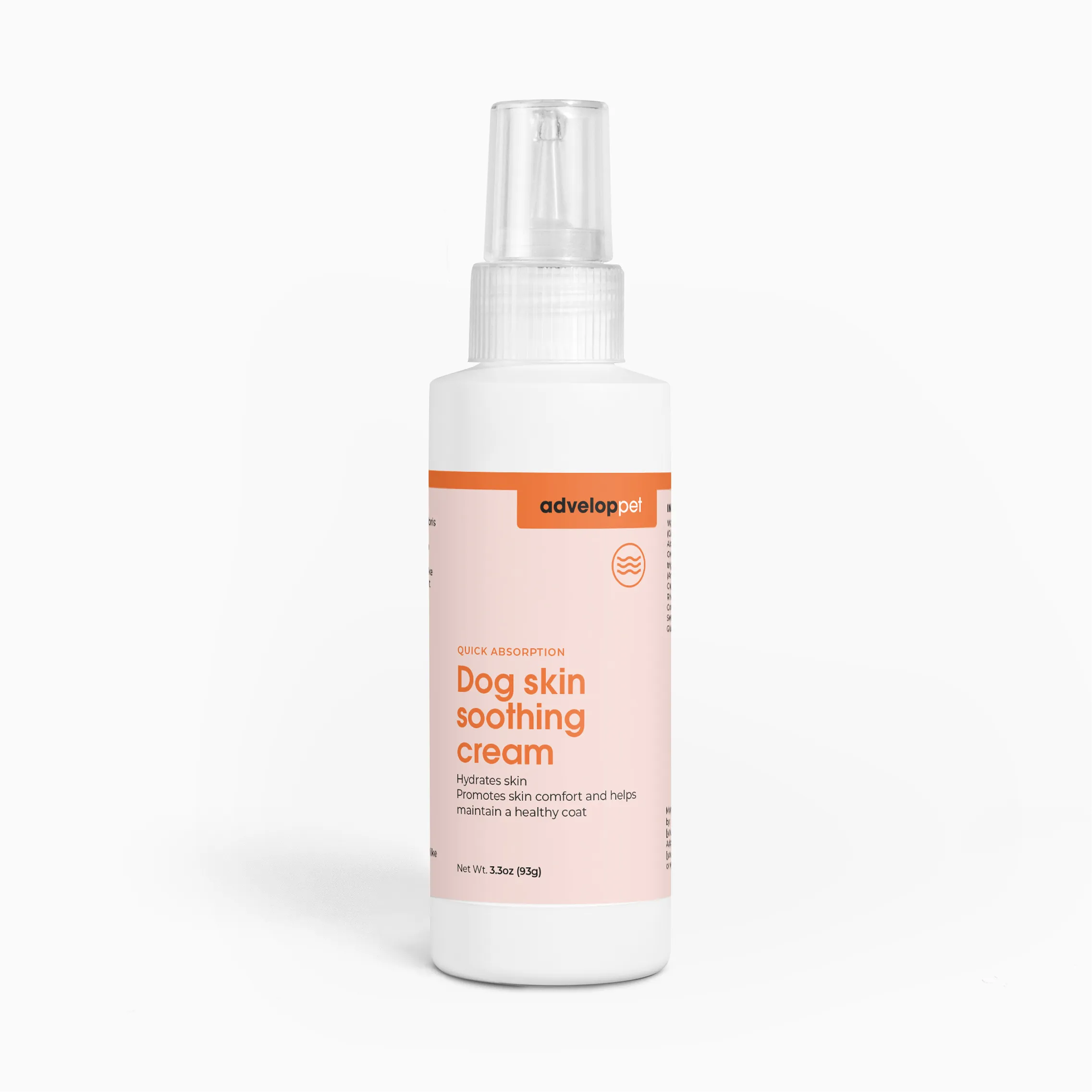
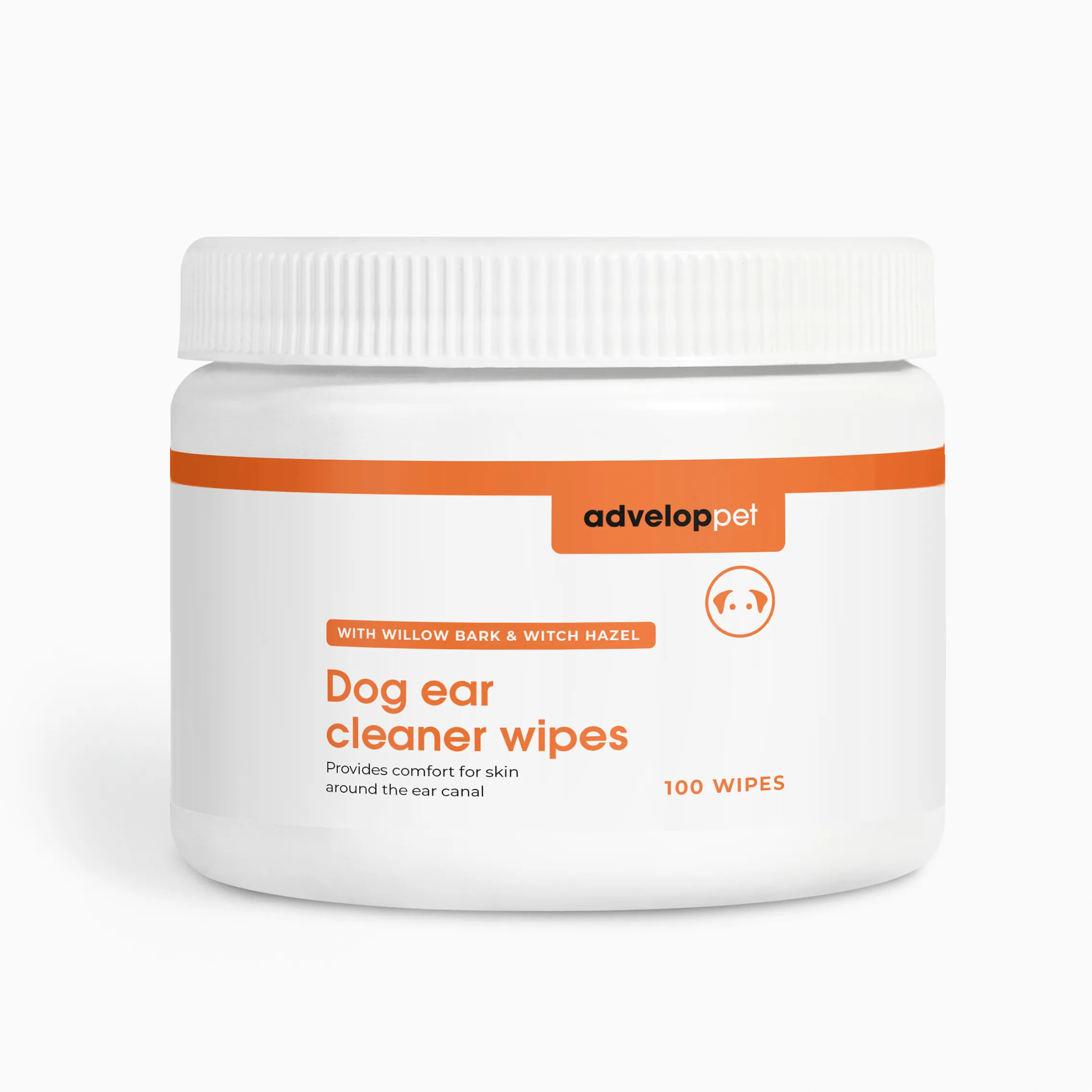
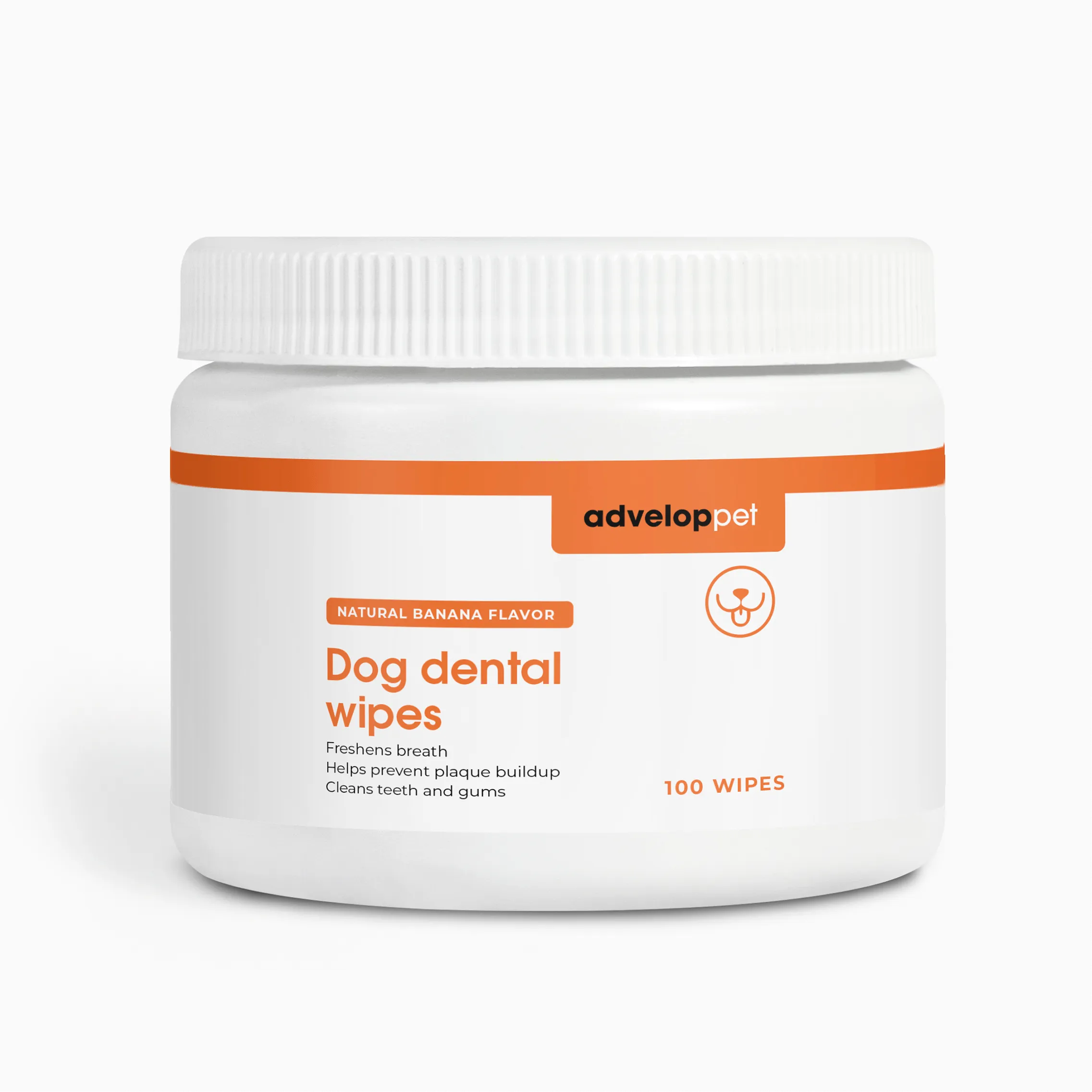
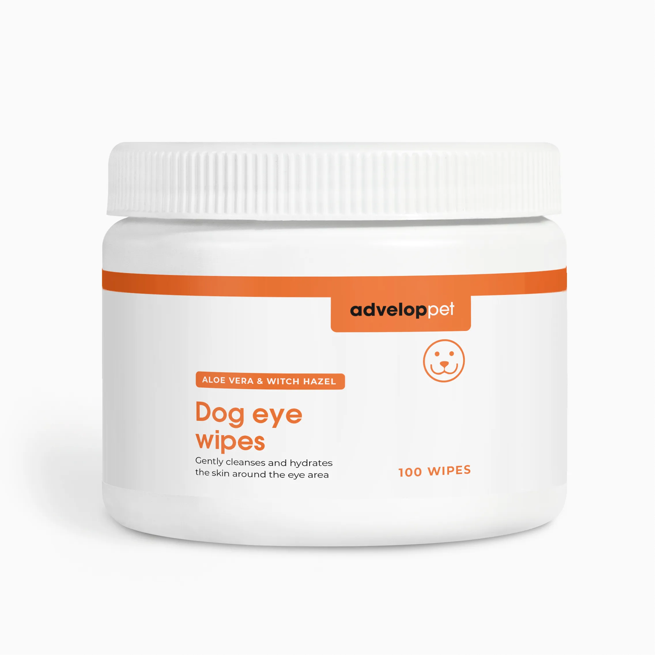
A packaging and label system for Advelop Pet, built across eight products. From shampoo and paw balm to dental and eye wipes, one consistent label architecture gives the entire range immediate shelf presence.
The work
Challenge
Advelop Pet needed packaging and labels that could hold their own in a competitive pet care category, while staying part of a larger brand. The client came to us with a logo and a base set of colours. What was missing was a label system built specifically for pet products: legible, trustworthy, and consistent across shampoos, balms, and wipes.
Process
We refined what was already there rather than starting from zero, tightening the existing logo and colours so they held up across packaging. Orange became the defining colour for the pet line, warm and distinct, giving every product an immediate visual anchor on shelf. For pet care products, clarity comes first: product name large and clear, function stated plainly underneath, nothing competing for attention.
Solution
Across the project we designed eight pet care products, from shampoo and paw balm to dental and eye wipes, all built on the same clean label architecture. Every product reads clearly on shelf while staying unmistakably part of the Advelop family.
Results
The result is a system that scales. As Advelop Pet adds new products, the framework already tells them how each new label should look, one system producing consistent results across the full range.