Brand Identity · E-commerce Web Design · Shopify Development
Dope Jewelry
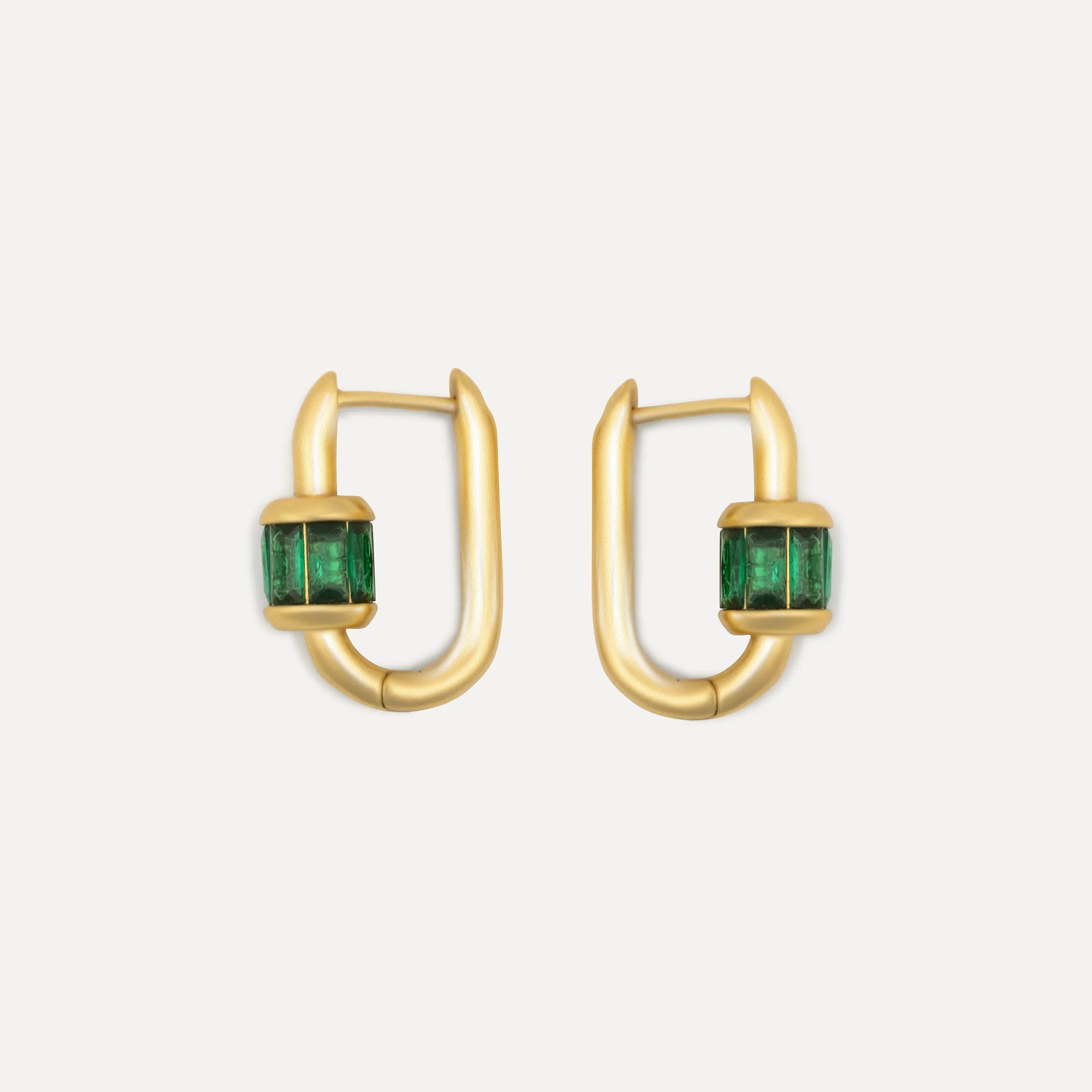
Dope is a jewelry brand born in Oslo, built around bold pieces, global collaborations, and recycled materials. We built a complete brand identity and commercial system from zero into a live Shopify store.
The work
Challenge
Dope is a jewelry brand born in Oslo, built around the idea that personal style is a statement, not a category. Bold pieces, global collaborations, recycled materials. The brand had a clear personality from the start, and the brief matched it: build an identity and a complete commercial system that could launch a brand from zero into a live store.
Process
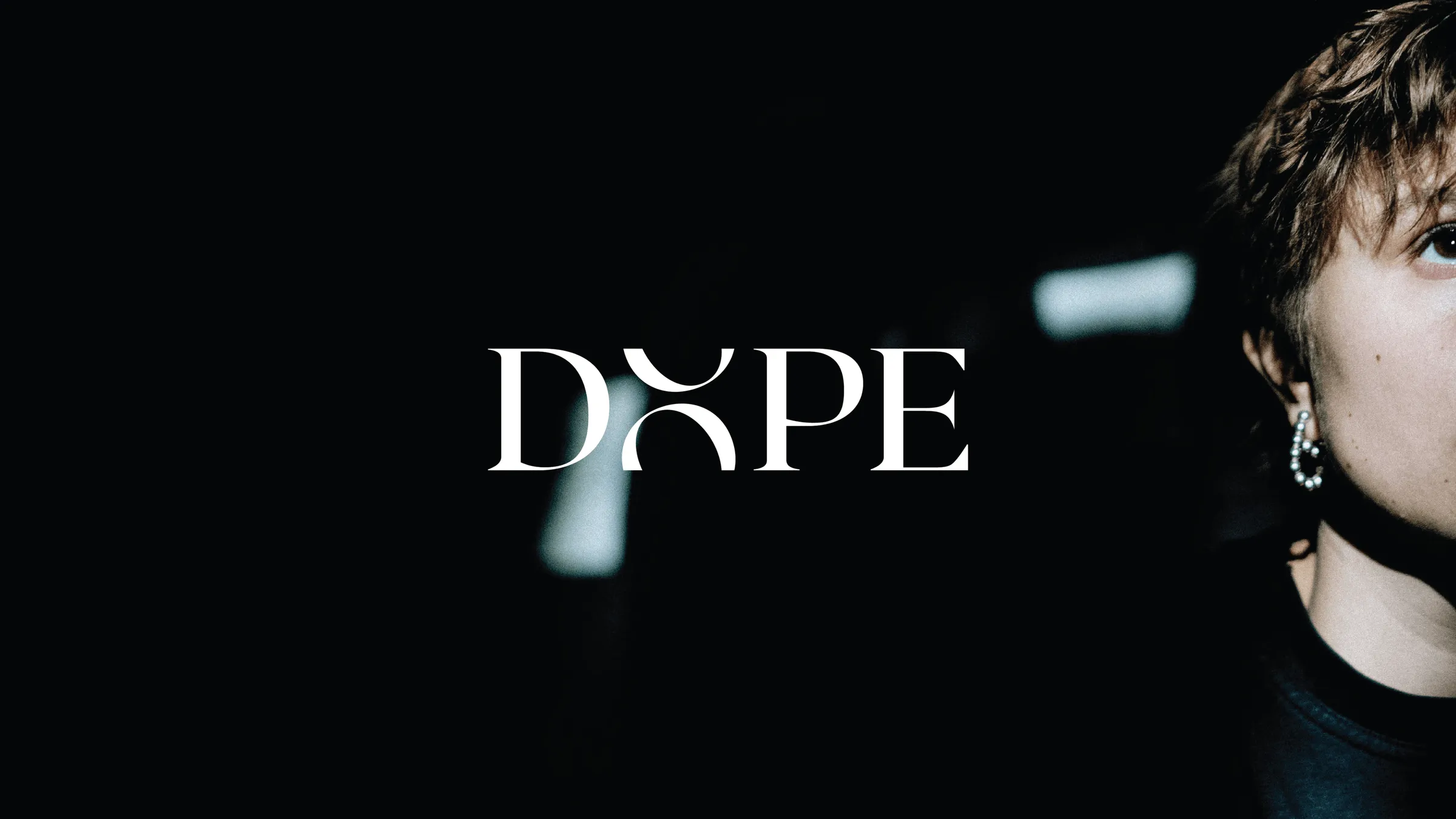
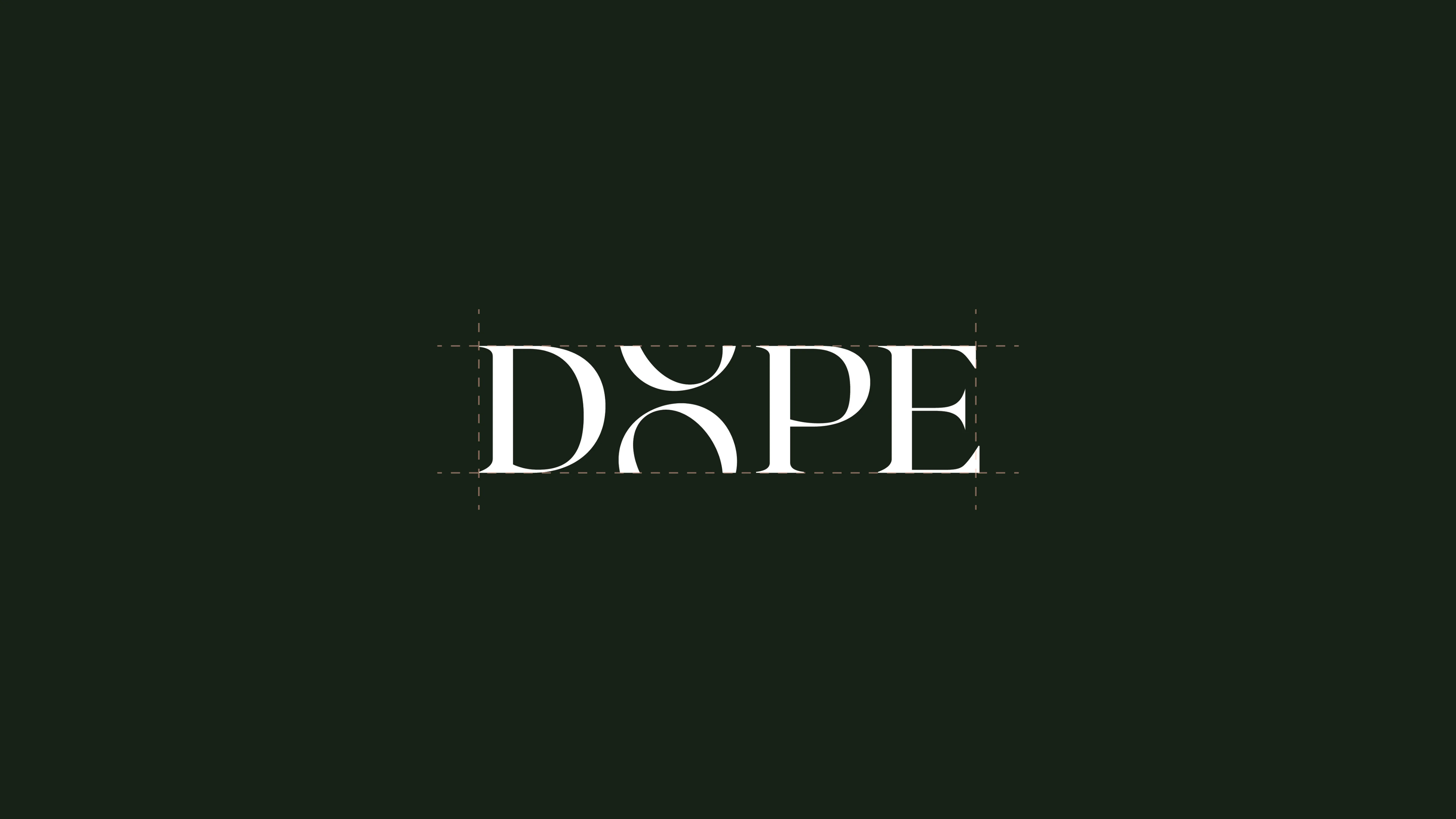
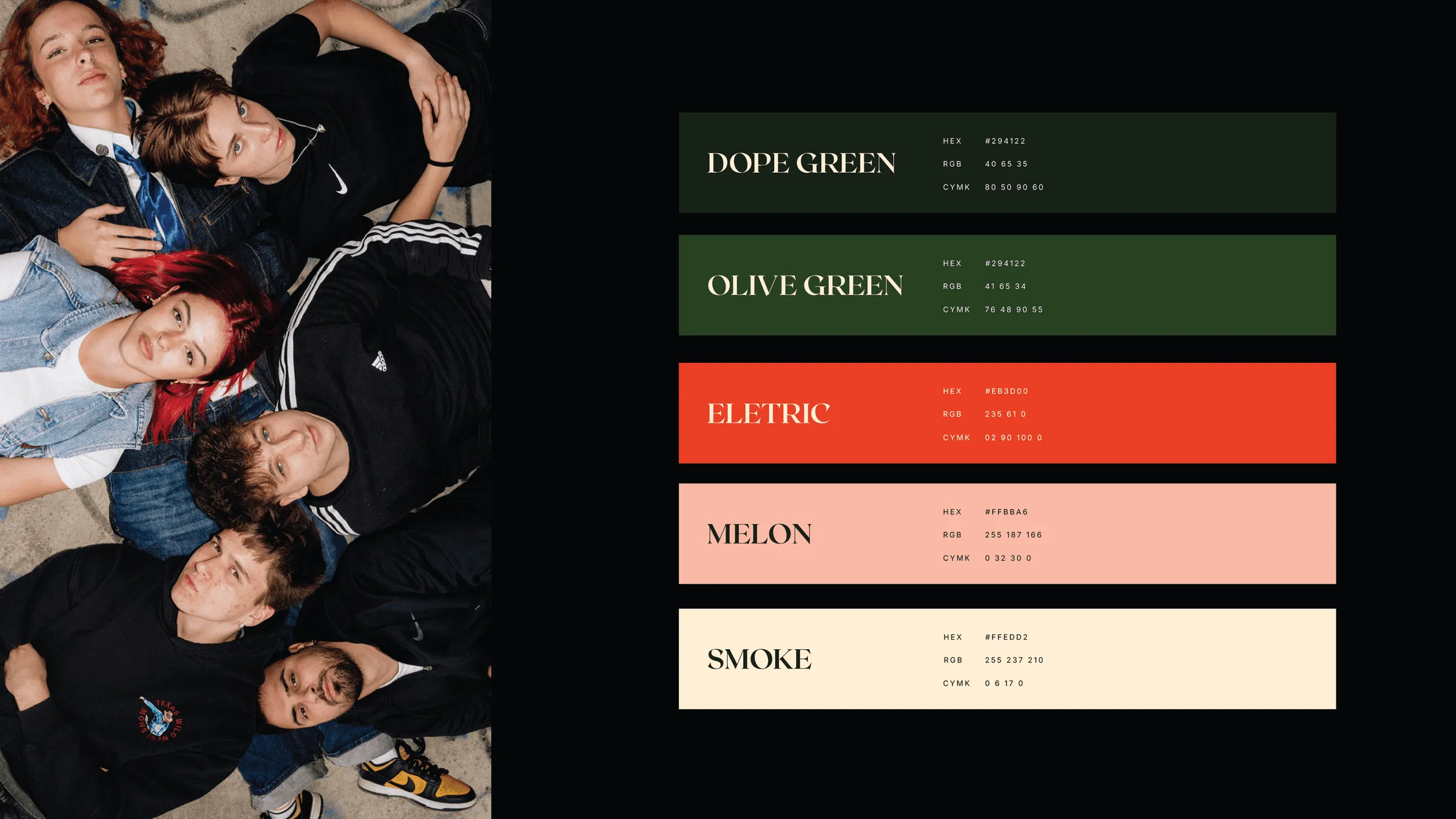
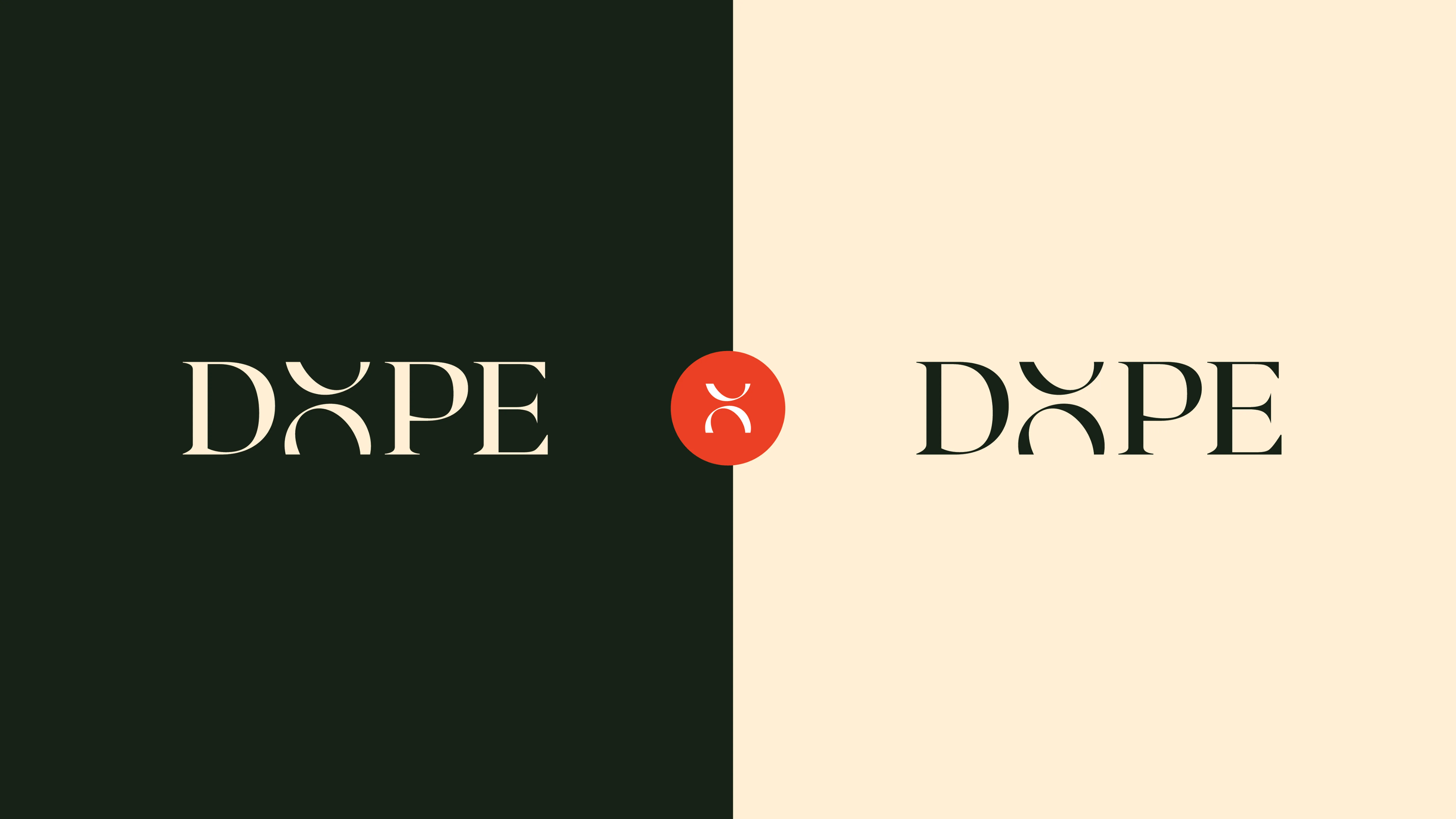
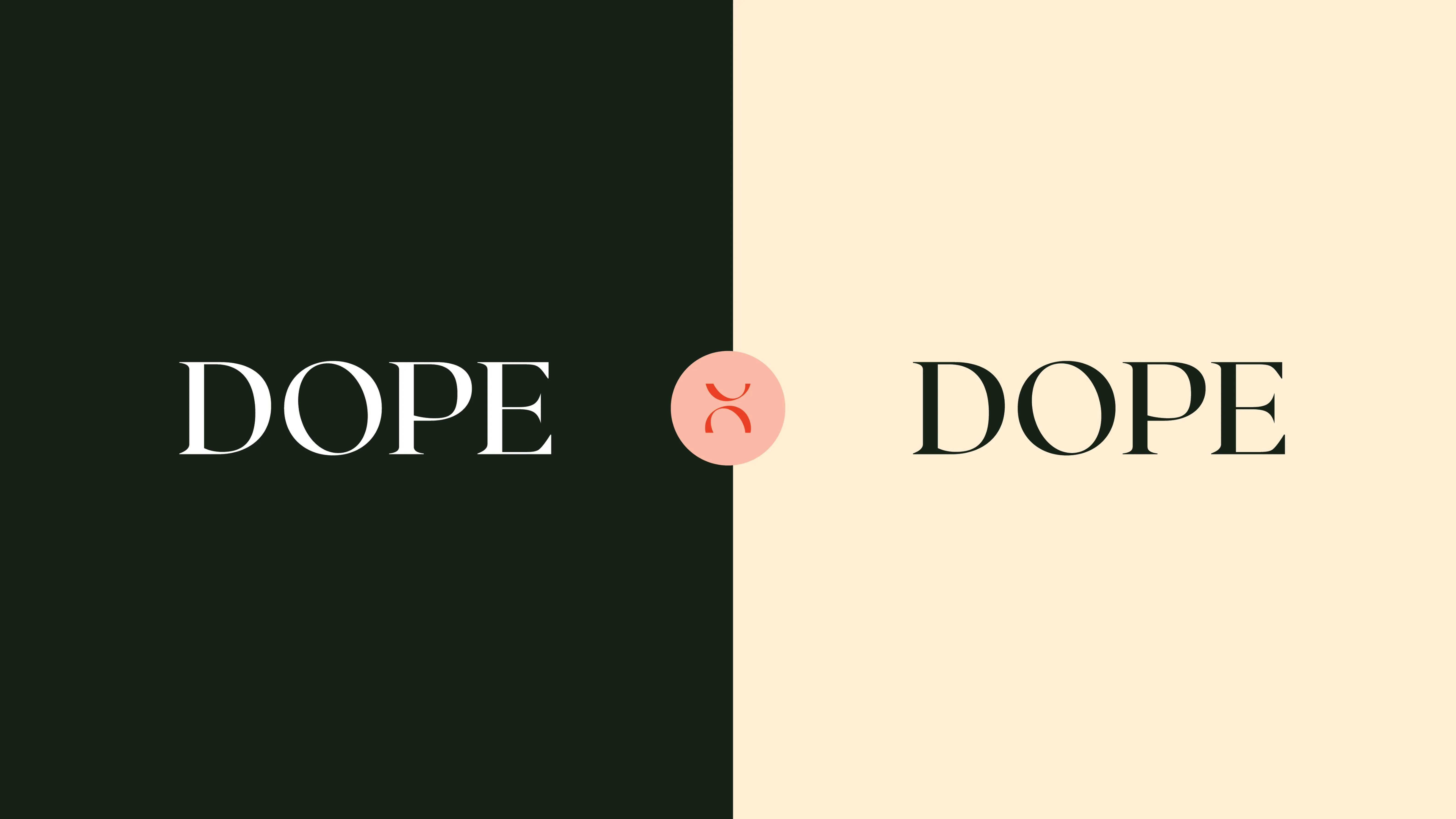
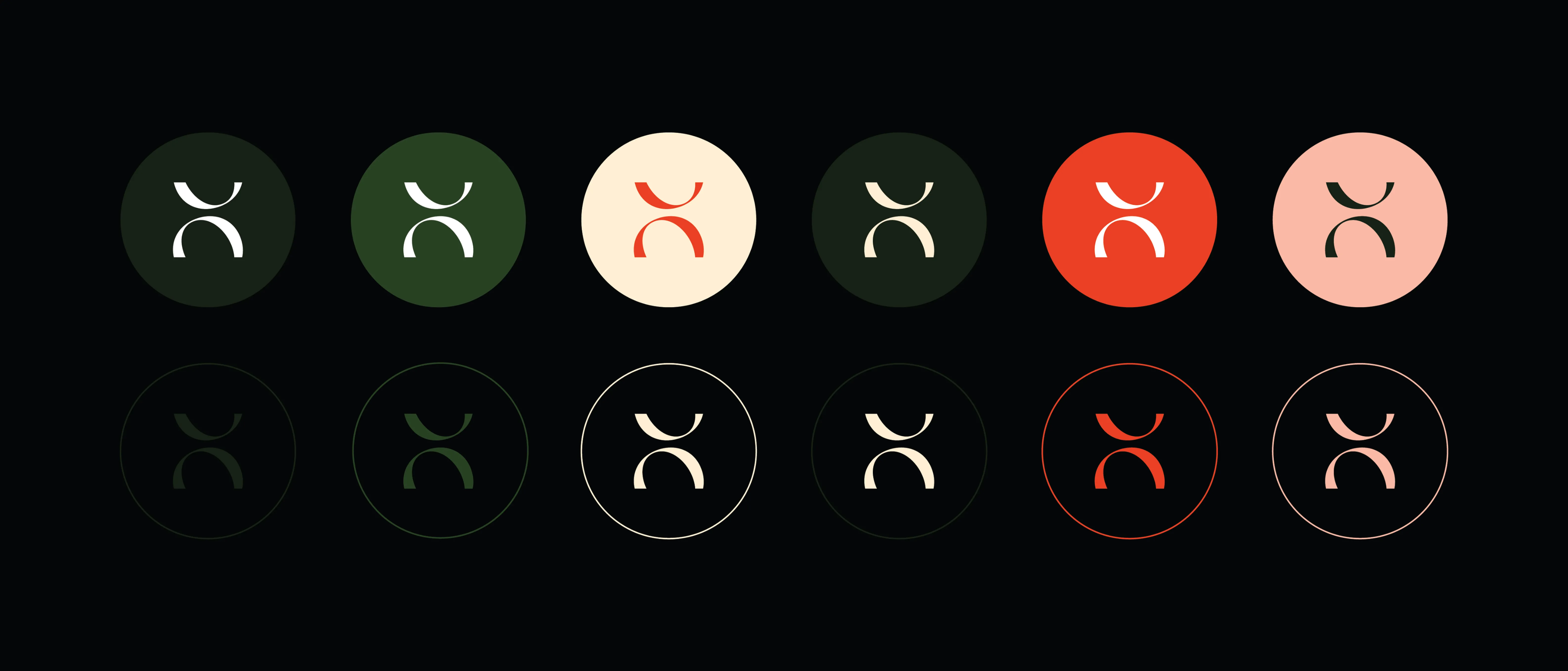
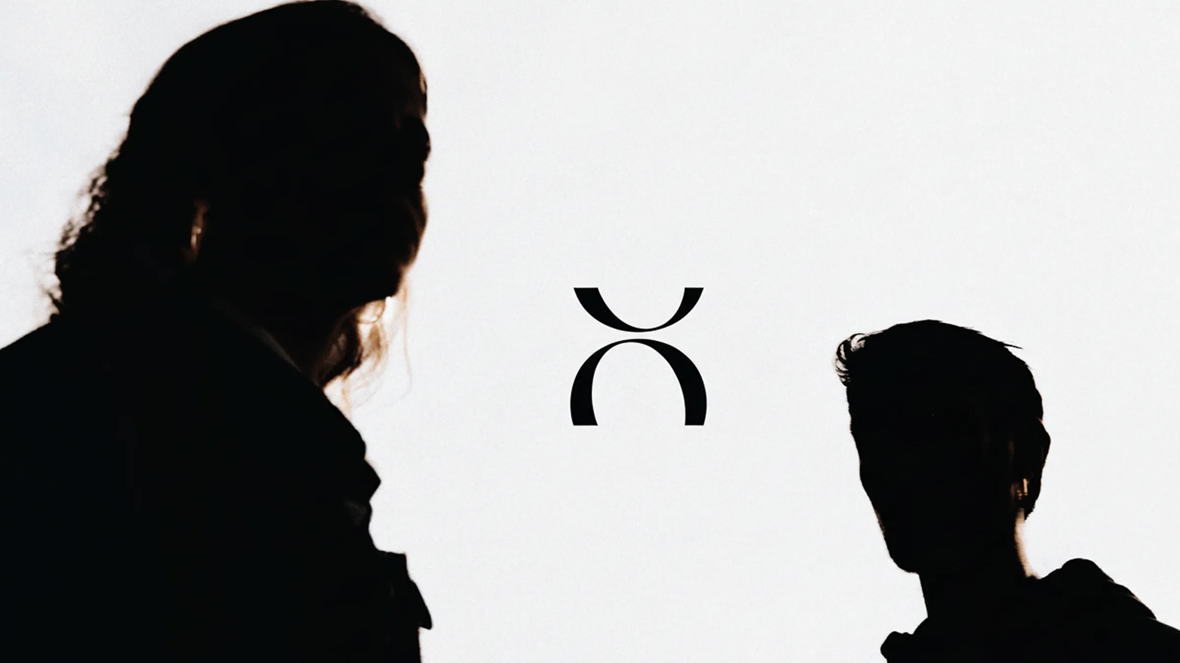
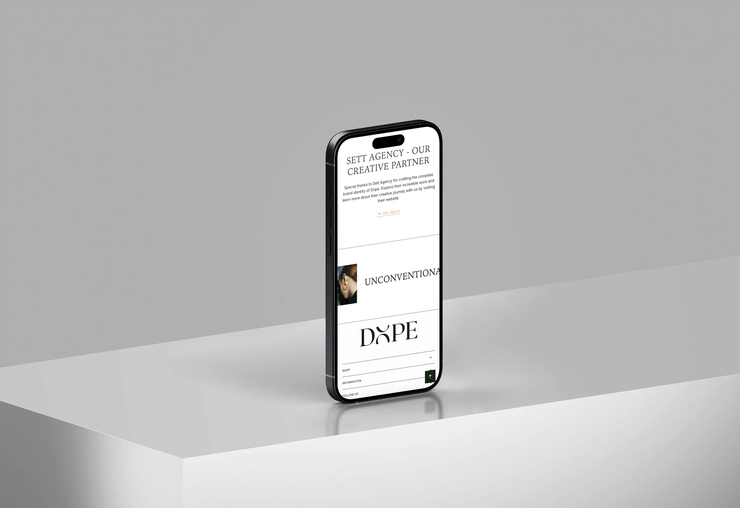
The visual identity started with the logo, and the logo started with a typographic decision that shaped everything else. The O in DOPE was replaced with a custom symbol, a form that works as both a letter and a standalone mark. That symbol became the brand's most versatile asset: it appears in the wordmark, functions independently as an icon across social media and product applications, and anchors the whole visual system without needing the full name around it. The colour palette pushed in the opposite direction from the jewelry sector's usual gold-on-black defaults. Dope Green as the primary, a deep forest tone grounded in confidence, paired with Electric red-orange for energy and Melon and Smoke as supporting tones. The result is a palette that reads as fashion-forward without trying too hard.
Solution
Roxborough CF as the primary typeface did specific work in the system: used exclusively for headings, with only the first letter capitalised, it preserved the same typographic logic used in the logo itself. When the heading font and the logo share the same typographic DNA, the brand reads as built, not assembled. Every element of the visual system, from icon to colour to type, was designed to work independently and together, so the brand holds whether it appears on a product tag, a social post, or a storefront.
Results
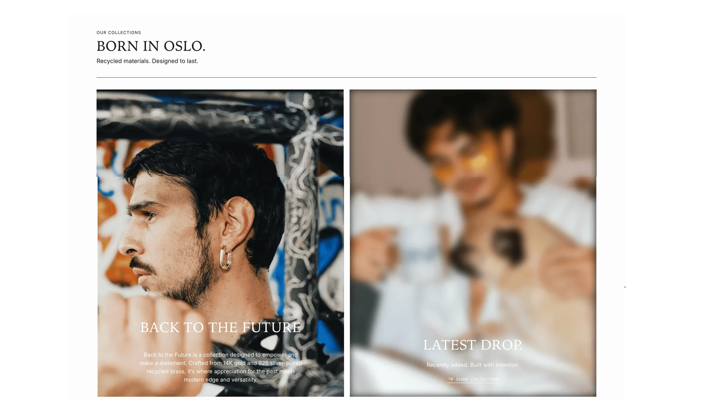
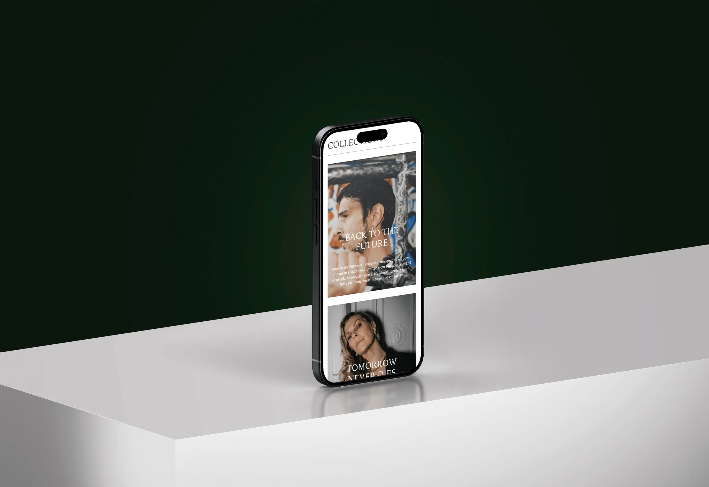
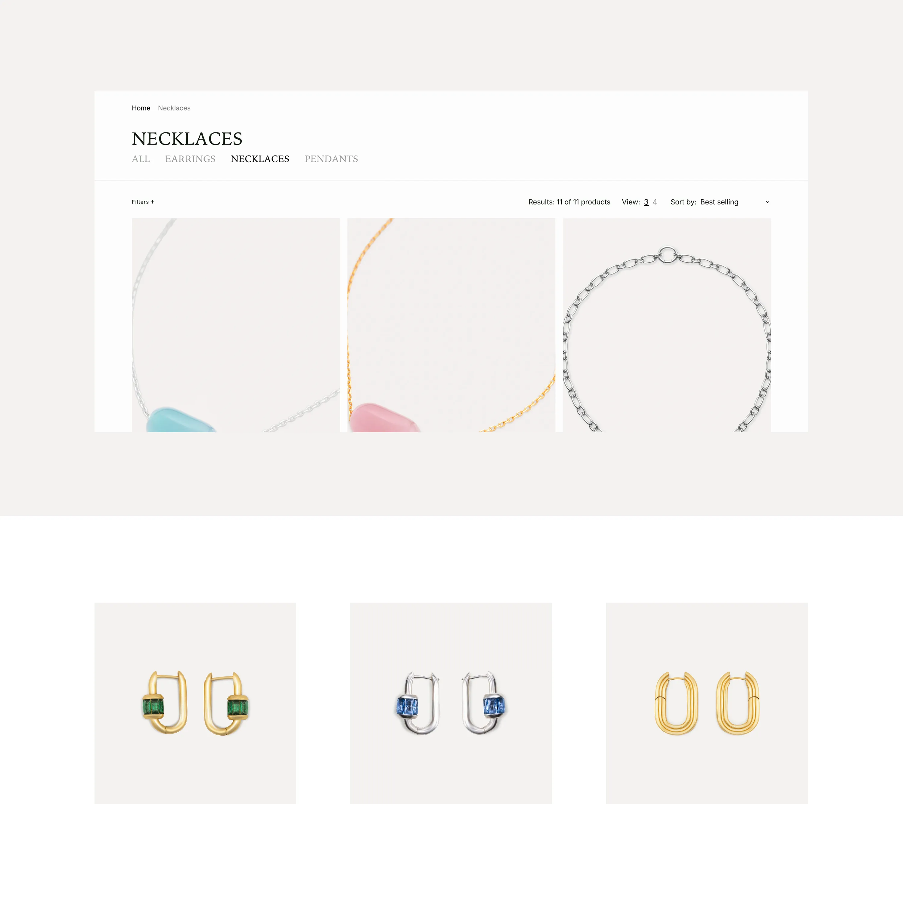
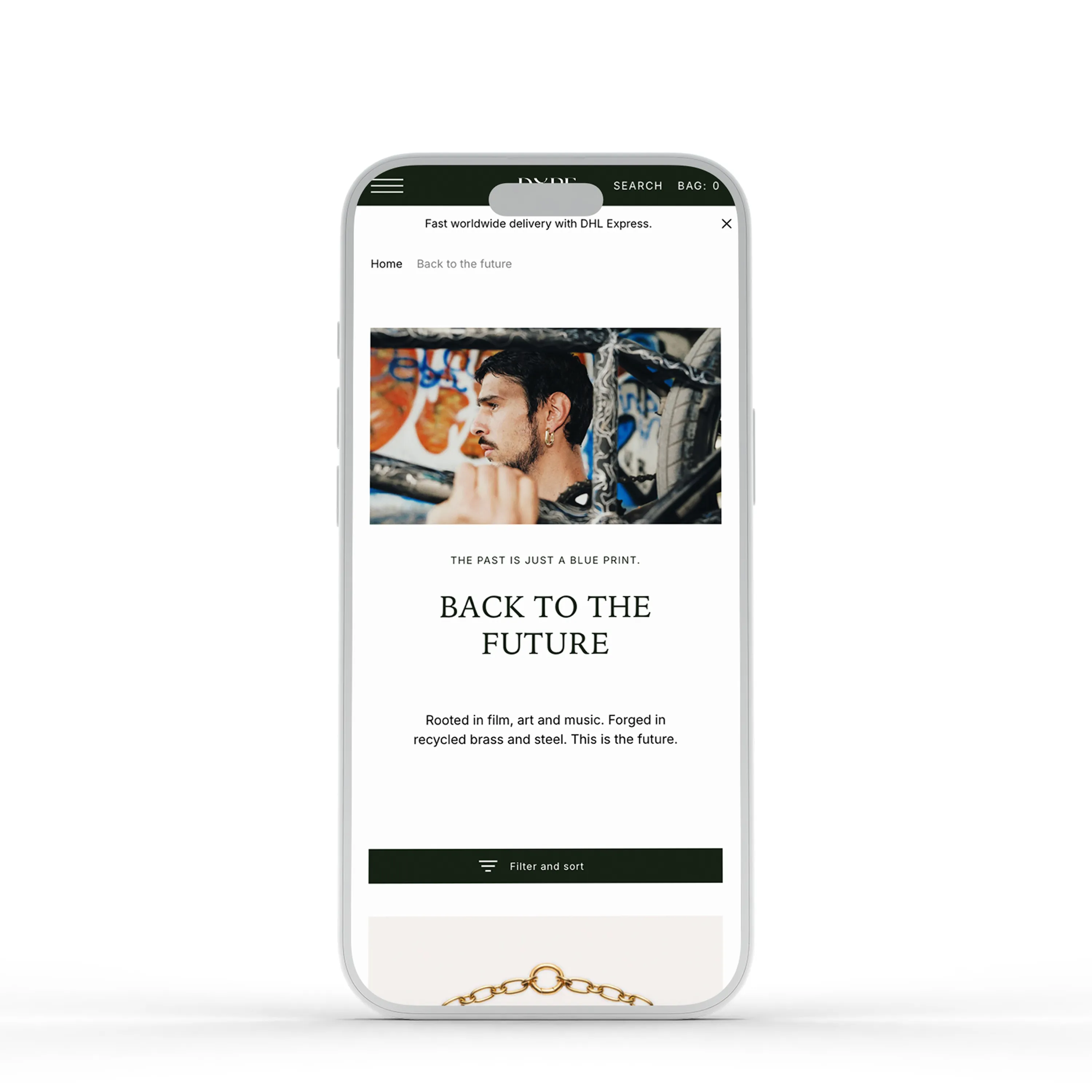
The Shopify store was structured around collections, not just products. Each drop has its own identity within the wider brand: Back to the Future, Tomorrow Never Dies, Bean Up, Dope x Cuzzo 28. The navigation reflects that thinking, giving each collection its own space while keeping the overall experience clean and direct. Free worldwide DHL delivery was built into the positioning from the start, a commercial decision that also signals confidence in the product and the brand behind it. Dope launched with a complete system in place, not just a logo and a website.
In their words.
Working with Sett has been one of the best creative partnerships I've had. They understand a brand beyond the brief and turn ideas into thoughtful, well-executed solutions, reliable, detail-oriented and genuinely invested in the outcome. They don't just deliver what you ask for, they think with you and make the final result stronger. I would recommend Sett to anyone looking for a creative partner they can truly trust.